NORDBLICK
NORDBLICK
NORDBLICK
CORPORATE IDENTITY
BRAND POSITIONING
CONCEPT DEVELOPMENT
NAMING
BRAND IDENTITY
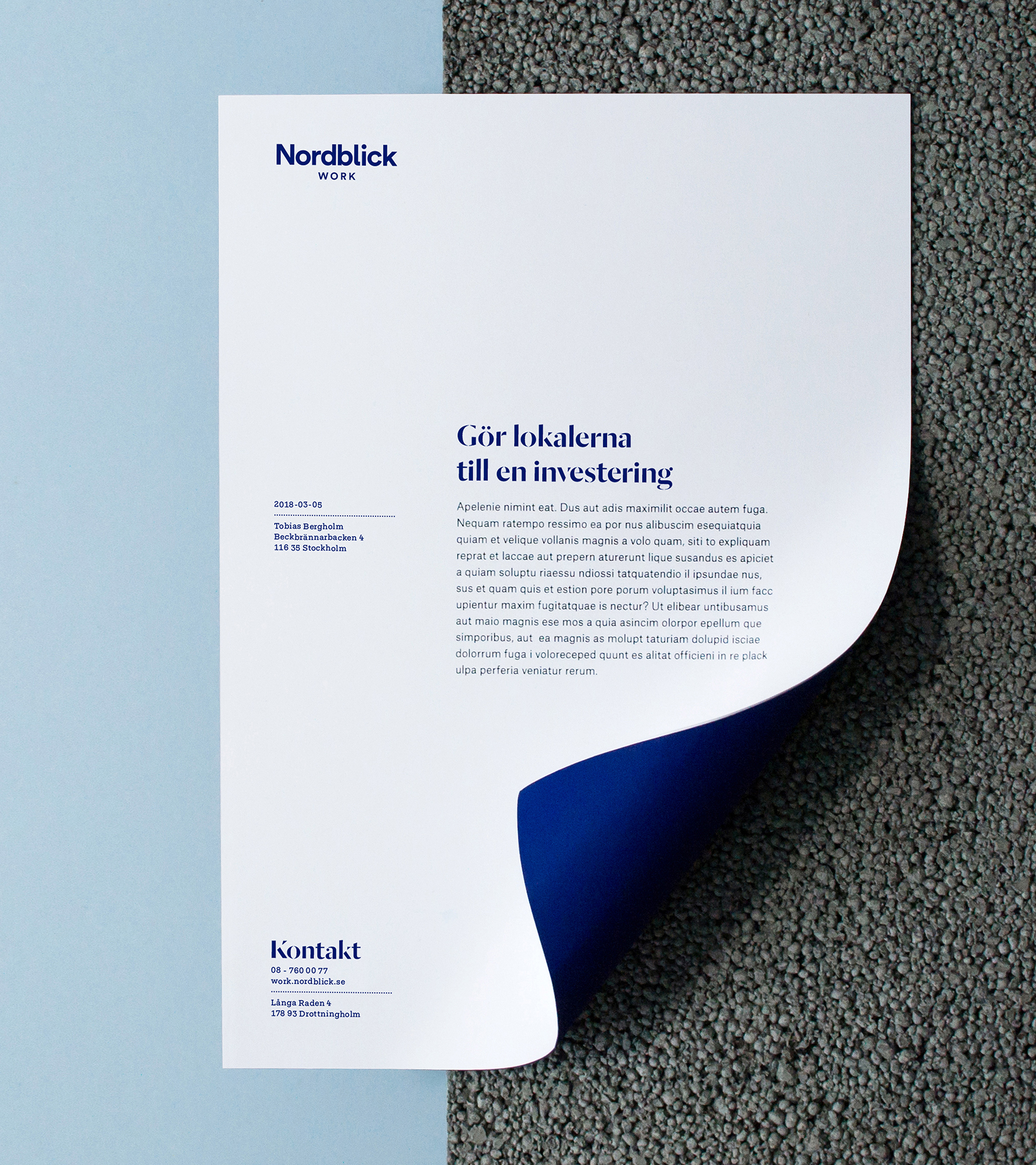
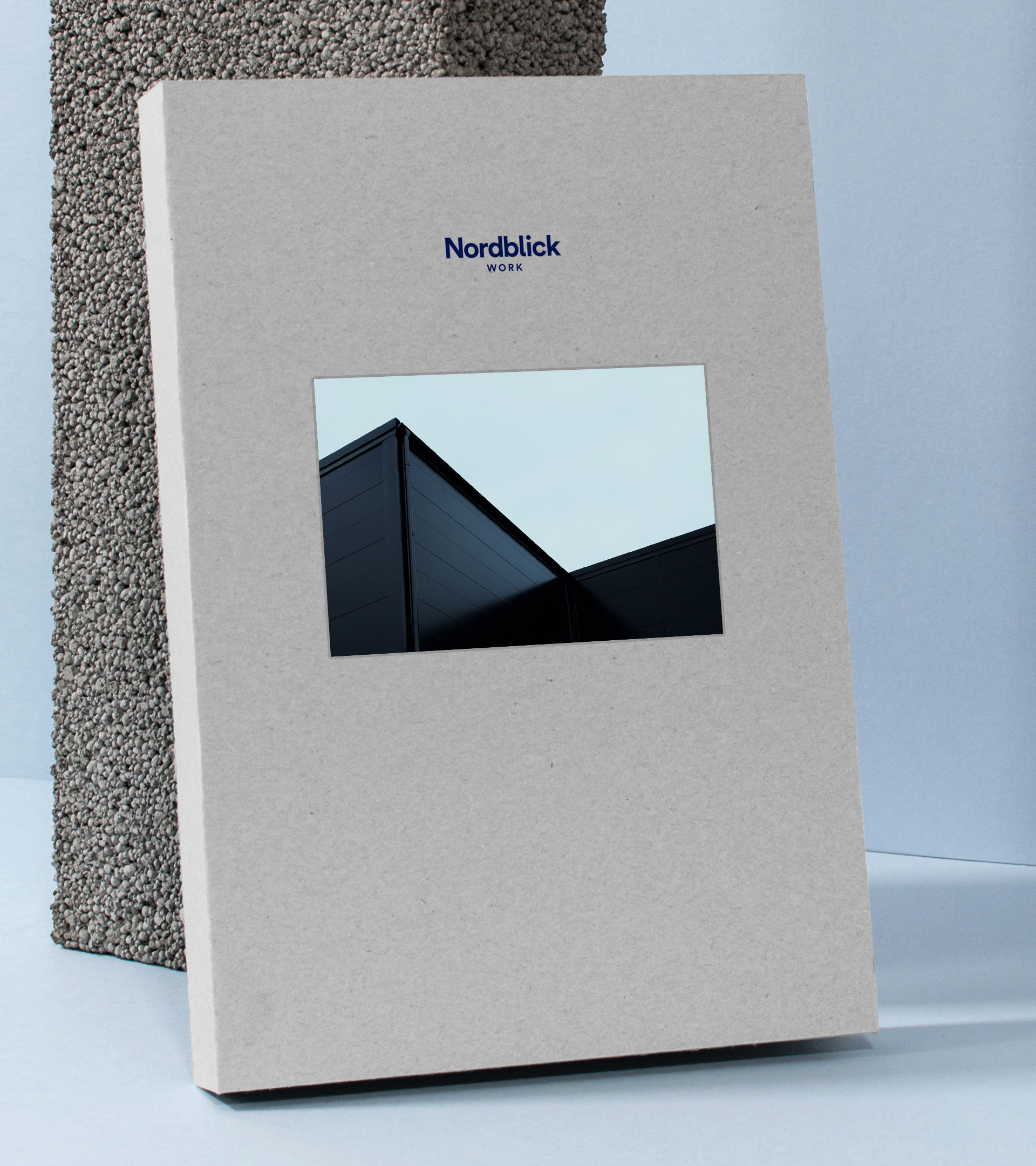
Nordblick – Painting with materials.
OVERVIEW
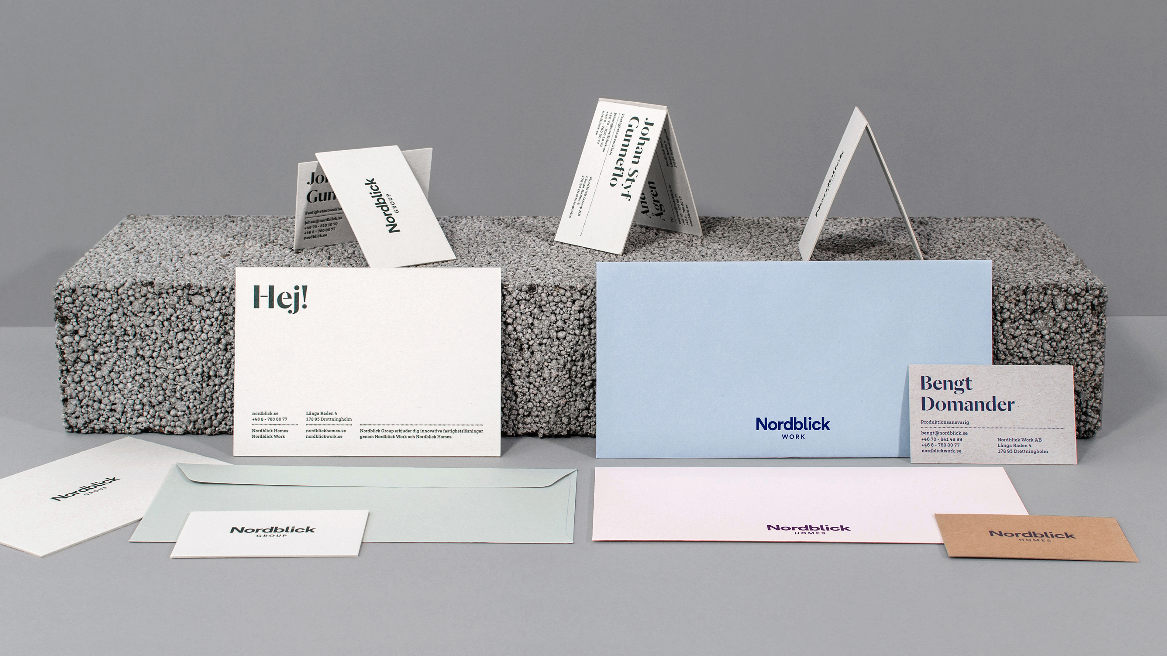
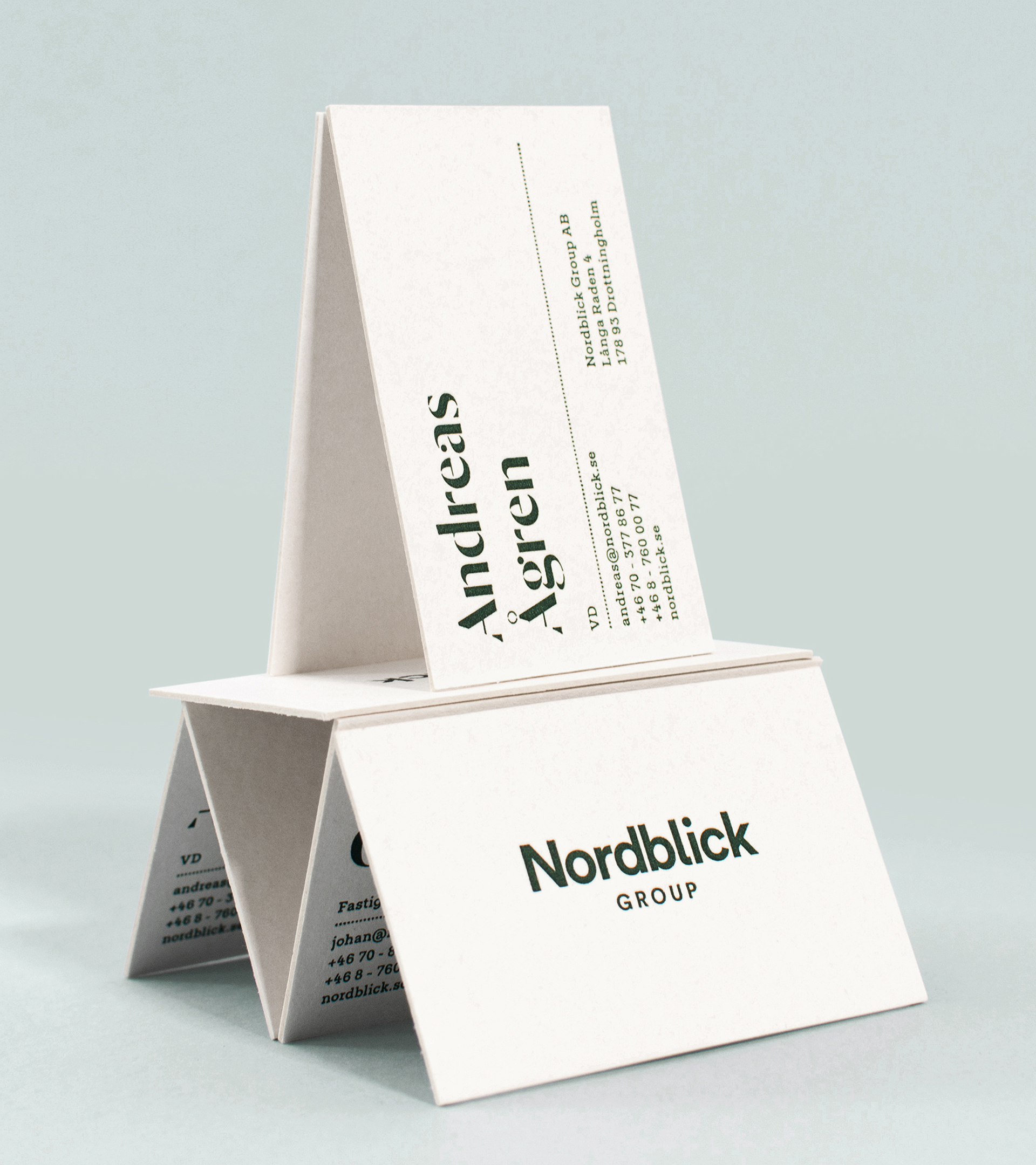
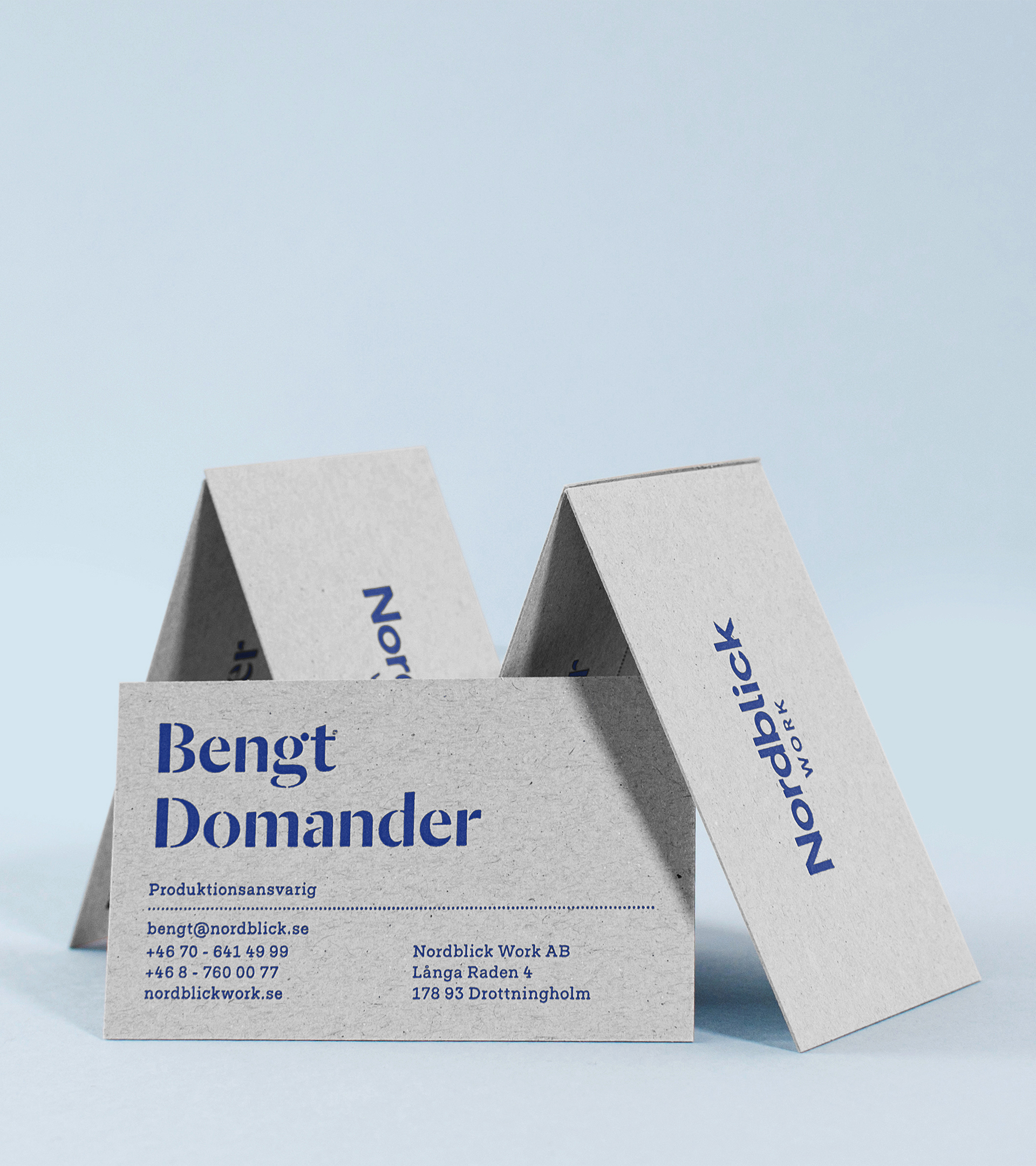
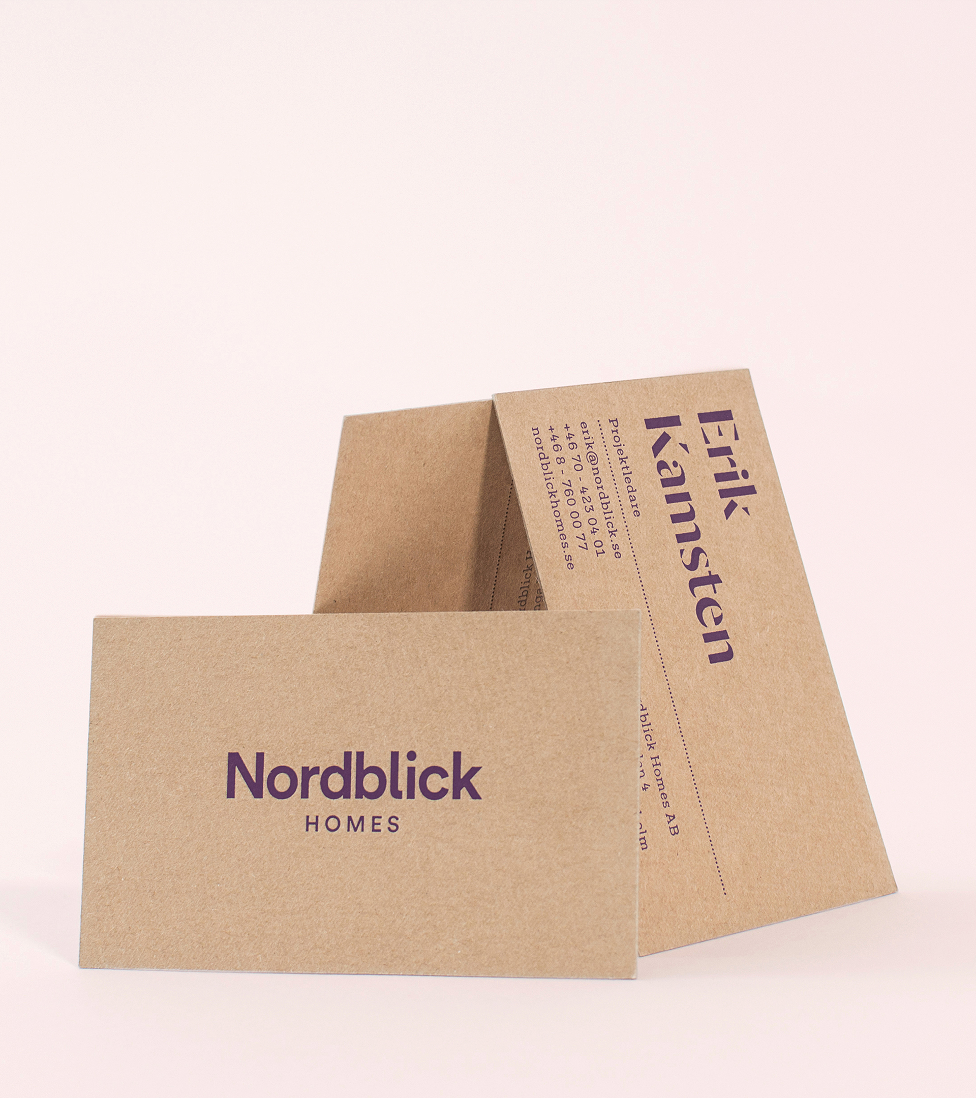
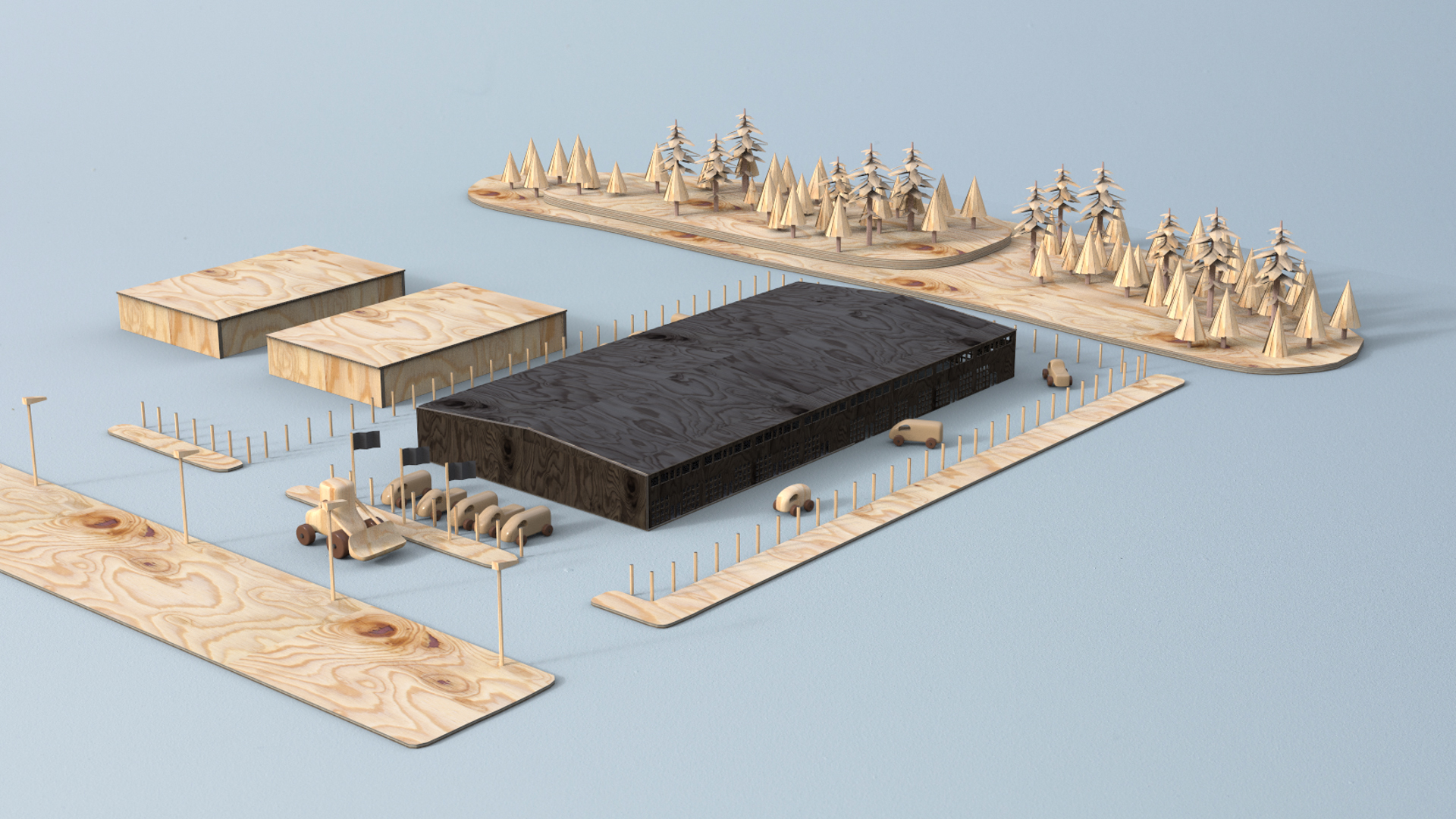
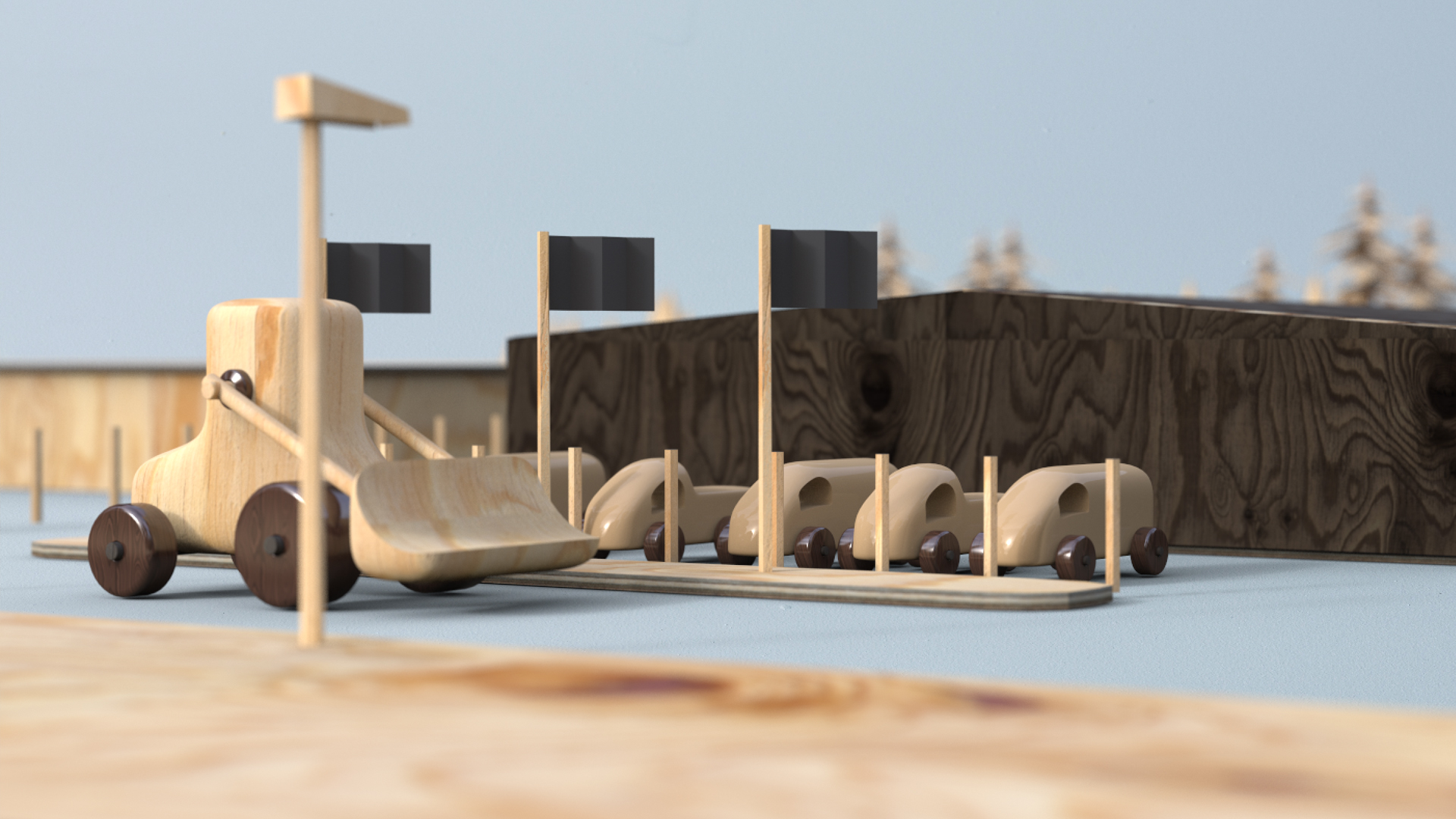
After a thorough strategic workshop, we aided in a total rebranding of construction company IQ Project by giving it a new name, three new sub-brands and a new visual identity. Our focus was on strengthening the high amount of care, quality and precision the company puts into its projects.
The people behind Nordblick come from the engineer and construction side of things. Their knowledge and particularity in materials was something I wanted to include and make visible in the identity. Therefore, I chose different print materials to represent building materials (recycled paper – Masonite; grey paper – cement). Paired with different color ranges, this became a big part of the branding, identifying the different sub-brands. The headline typography is inspired by the labeling of tools at construction sites, but with a slightly more elegant twist, reminiscent of typography found on old blueprints by Le Corbusier.


A SELECTION OF WORK