CEDERQUIST
CEDERQUIST
CEDERQUIST
WEB DESIGN
DESIGN APPLICATION
UX DESIGN
WEB DESIGN
Cederquist – Design as a balancing act.
OVERVIEW
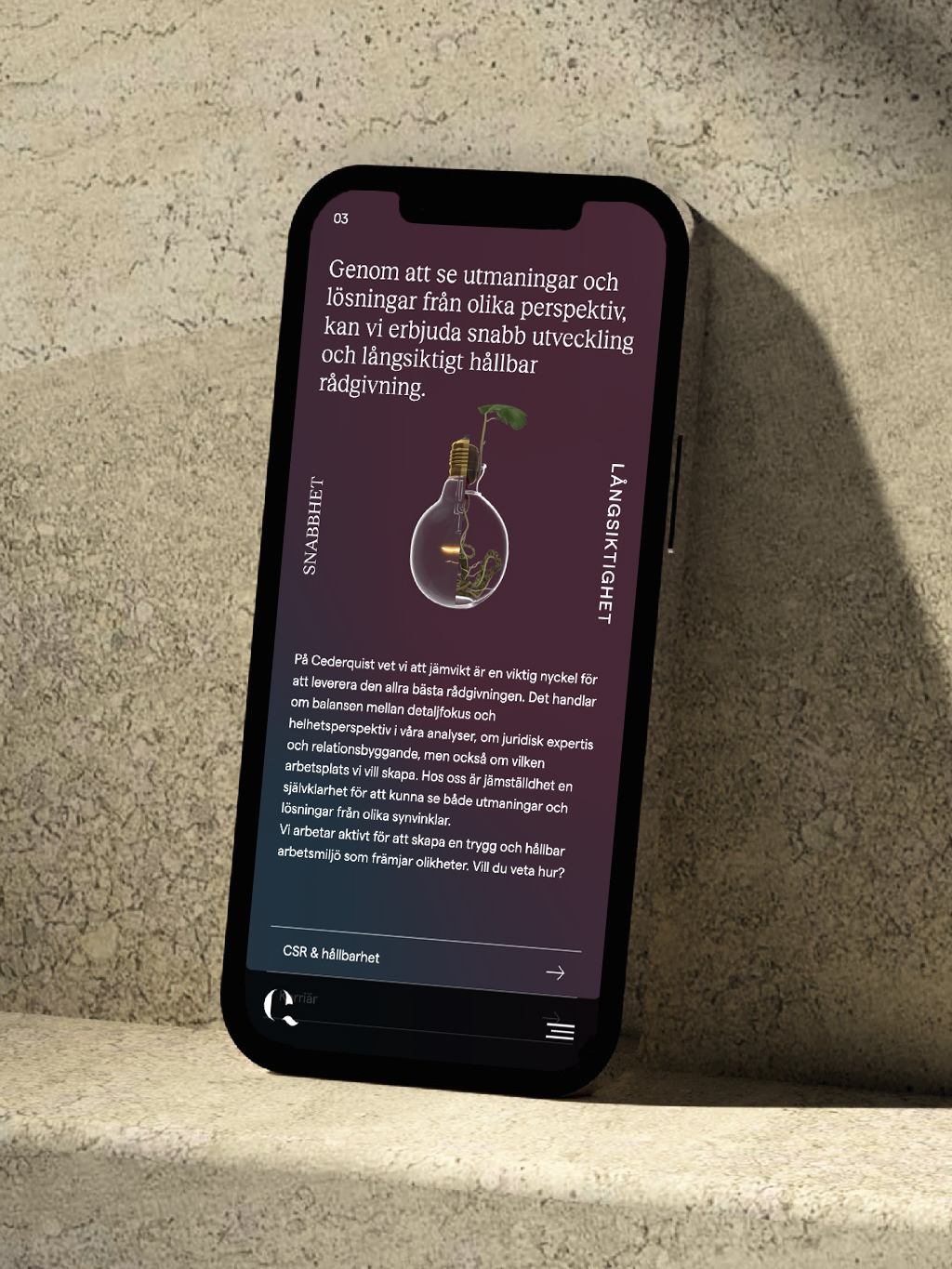
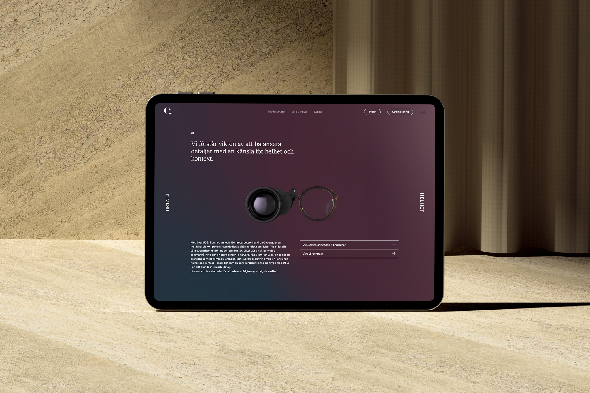
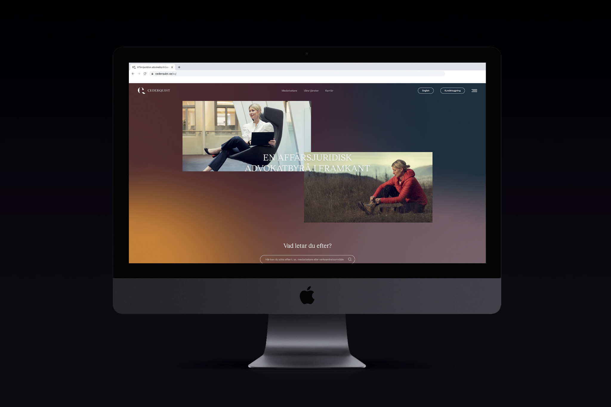
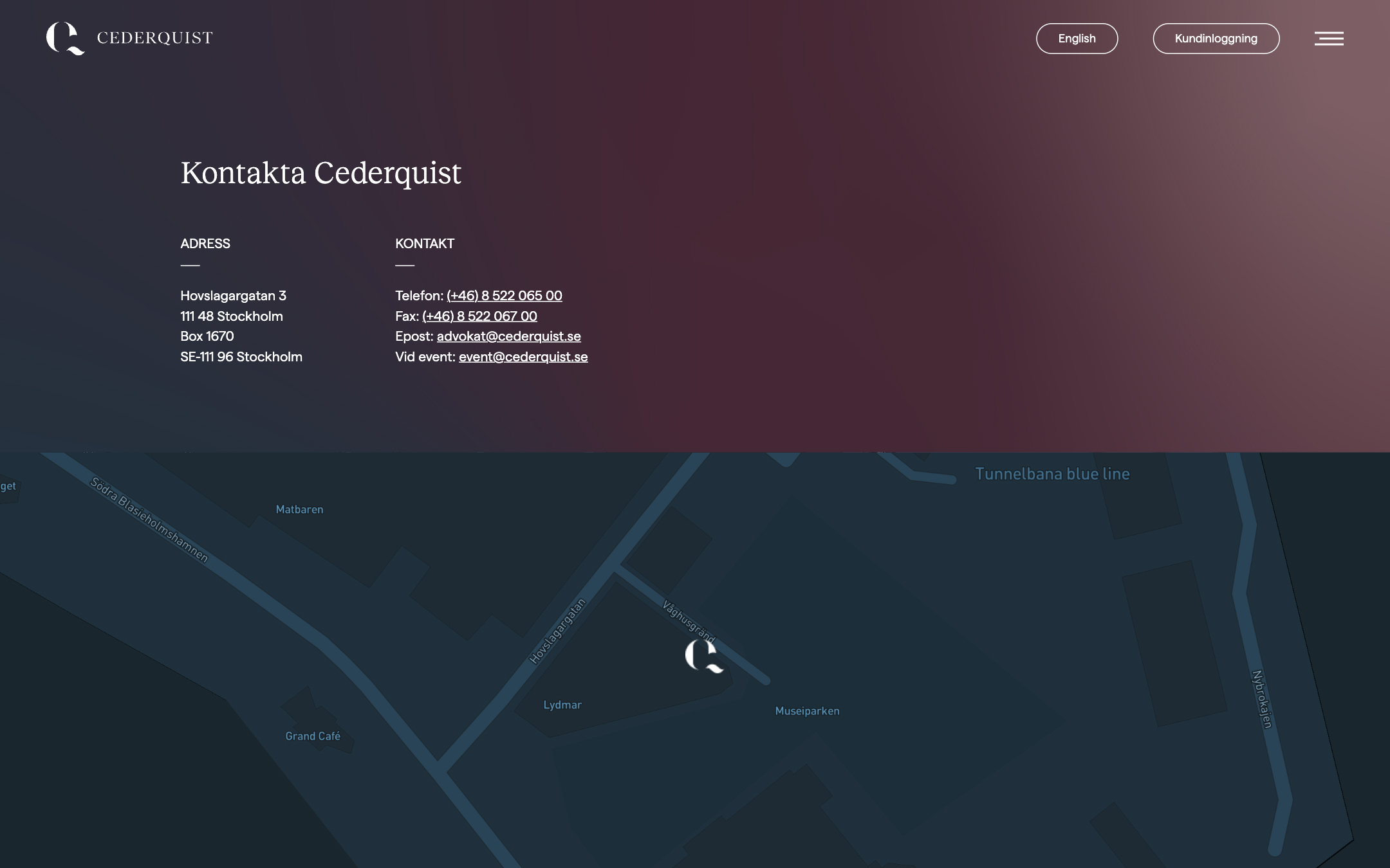
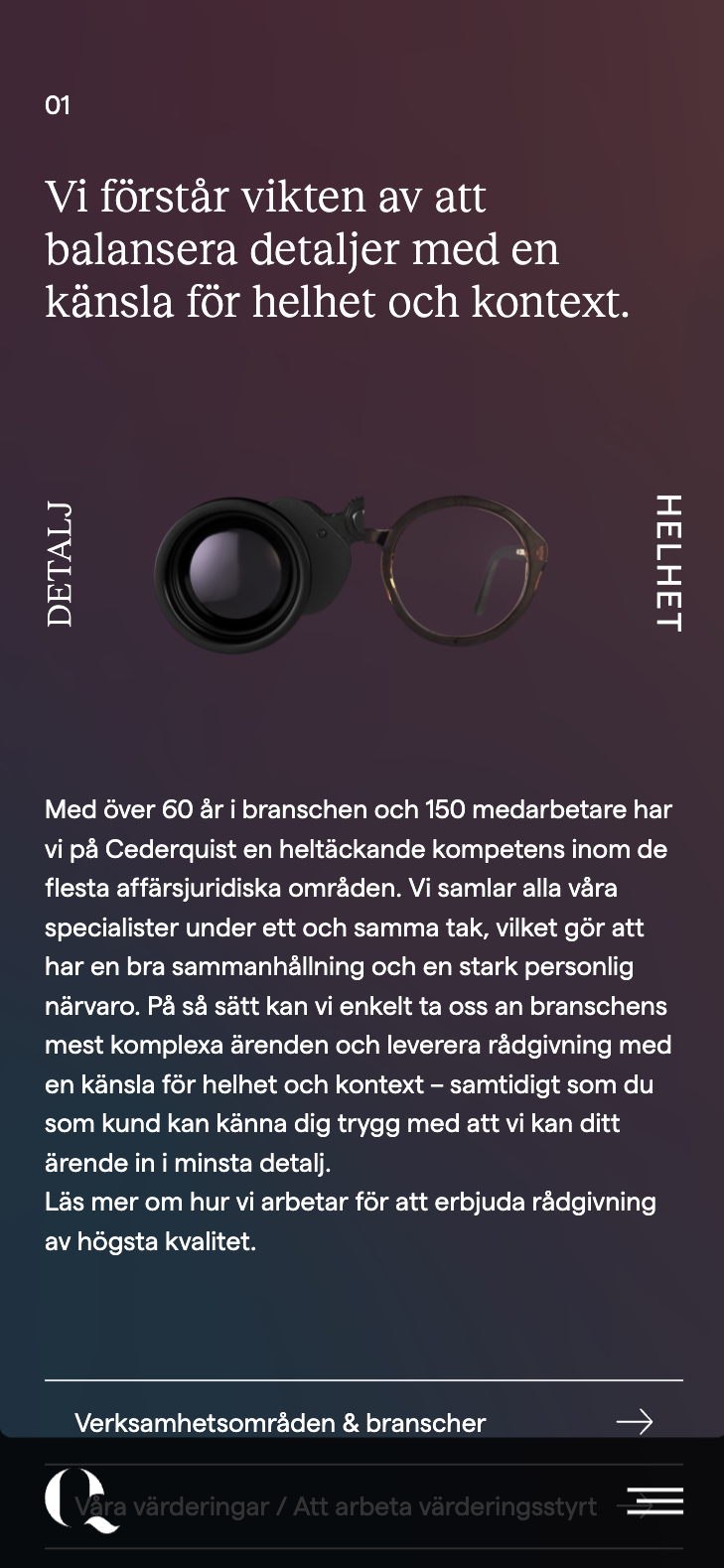
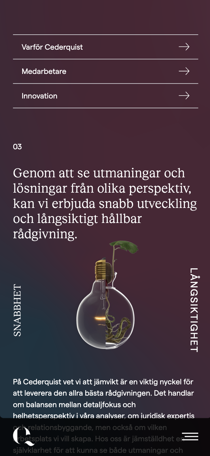
Cederquist is one of the top corporate law firms in Sweden. They compete in a cutthroat business where almost all firms have the same services and expression. They had just updated their brand with a new visual identity when I was asked to design new website to go along with it. Doing this I faced some main challenges. The first one was to restructure the whole site and all its content, making it relevant and easy to navigate – Cederquist has a lot of different services, employees and above all articles. The second one was to adapt the new identity to the digital space. The visual concept revolved around the idea of balance and was called Equilibrium.
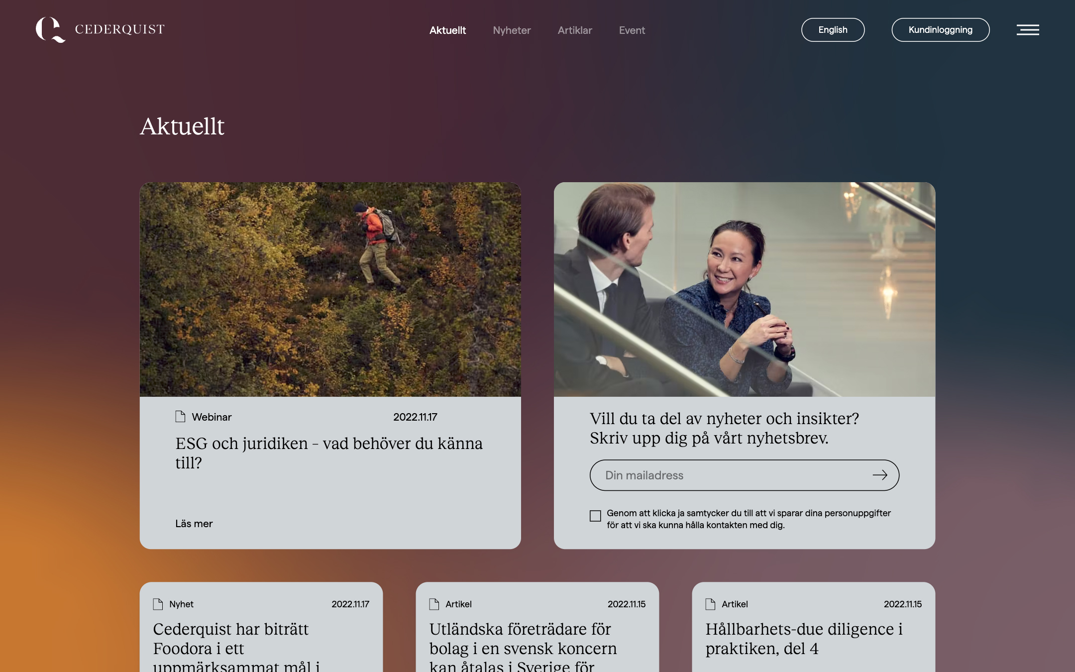
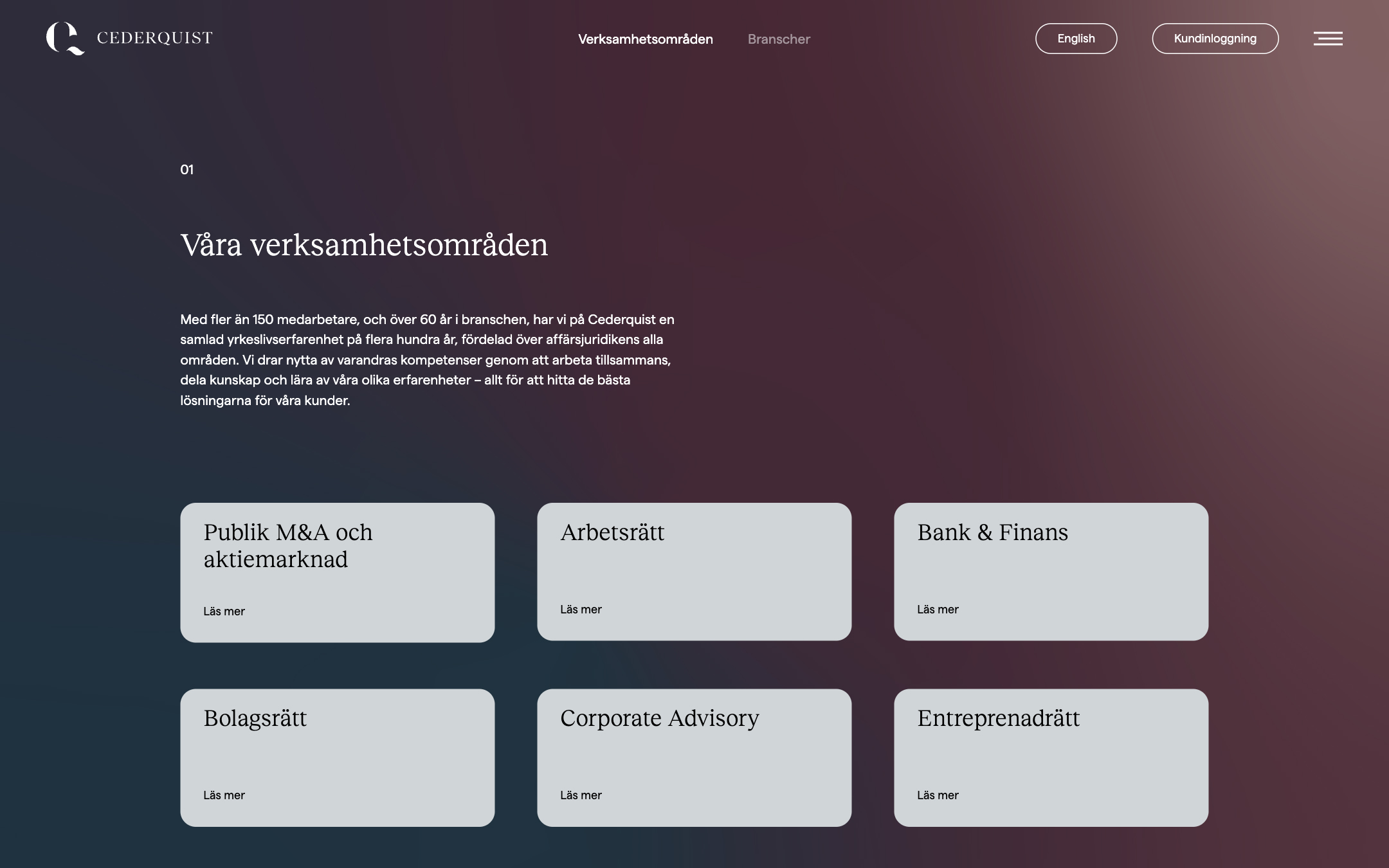
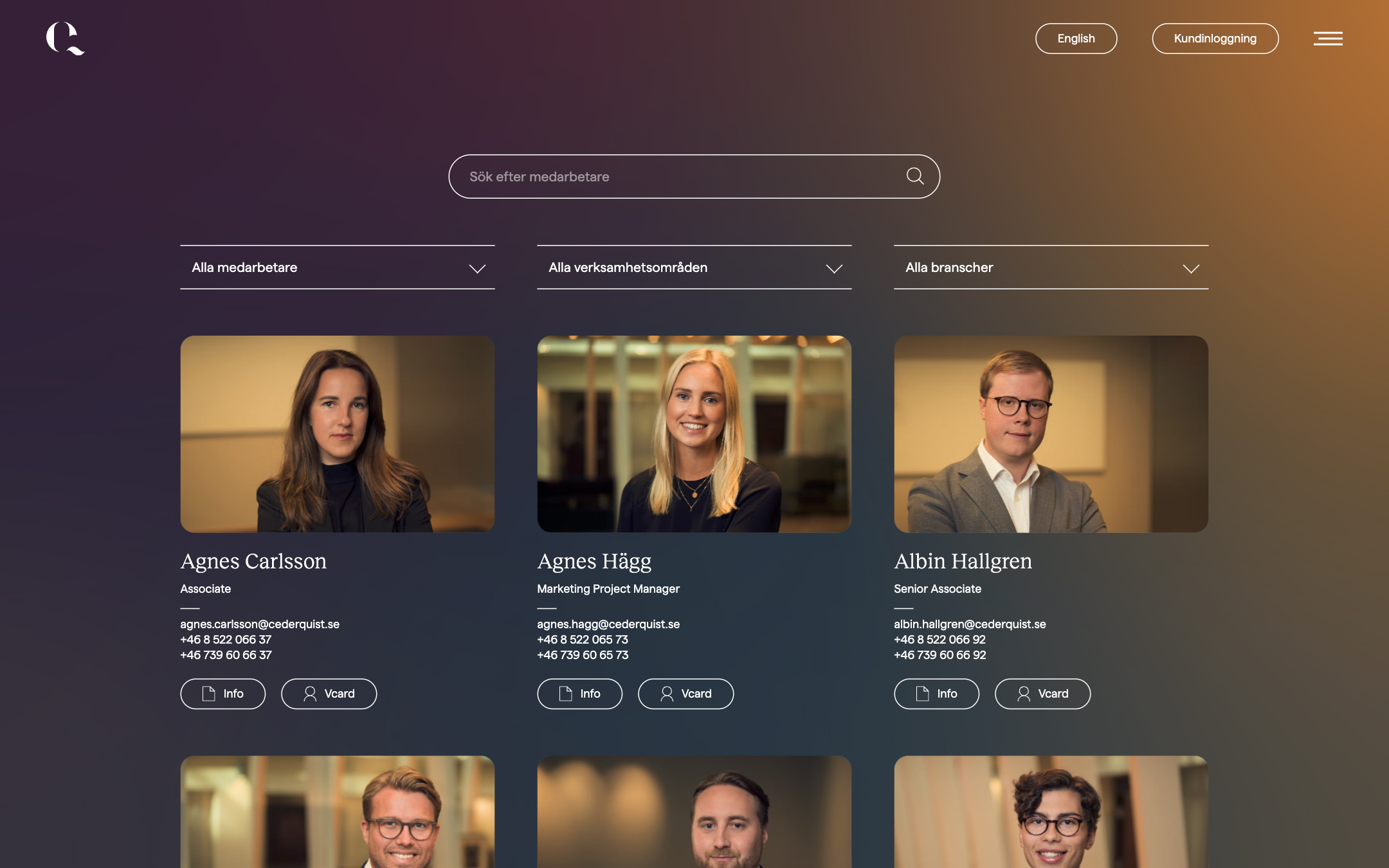
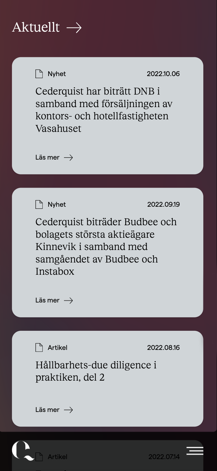
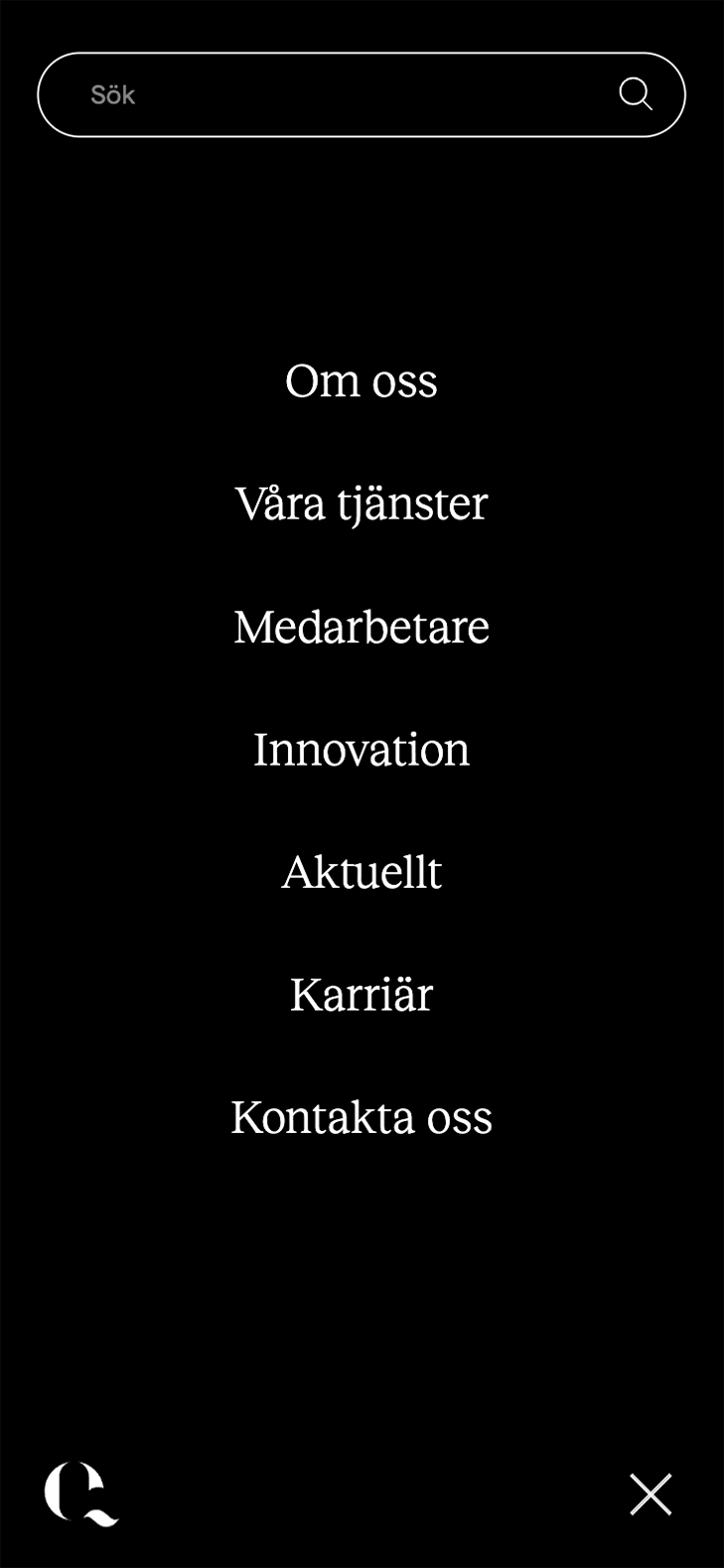
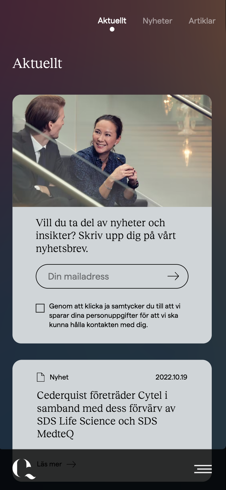
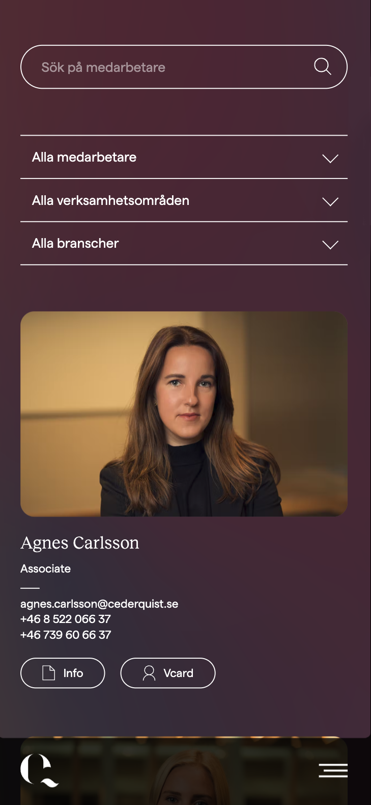
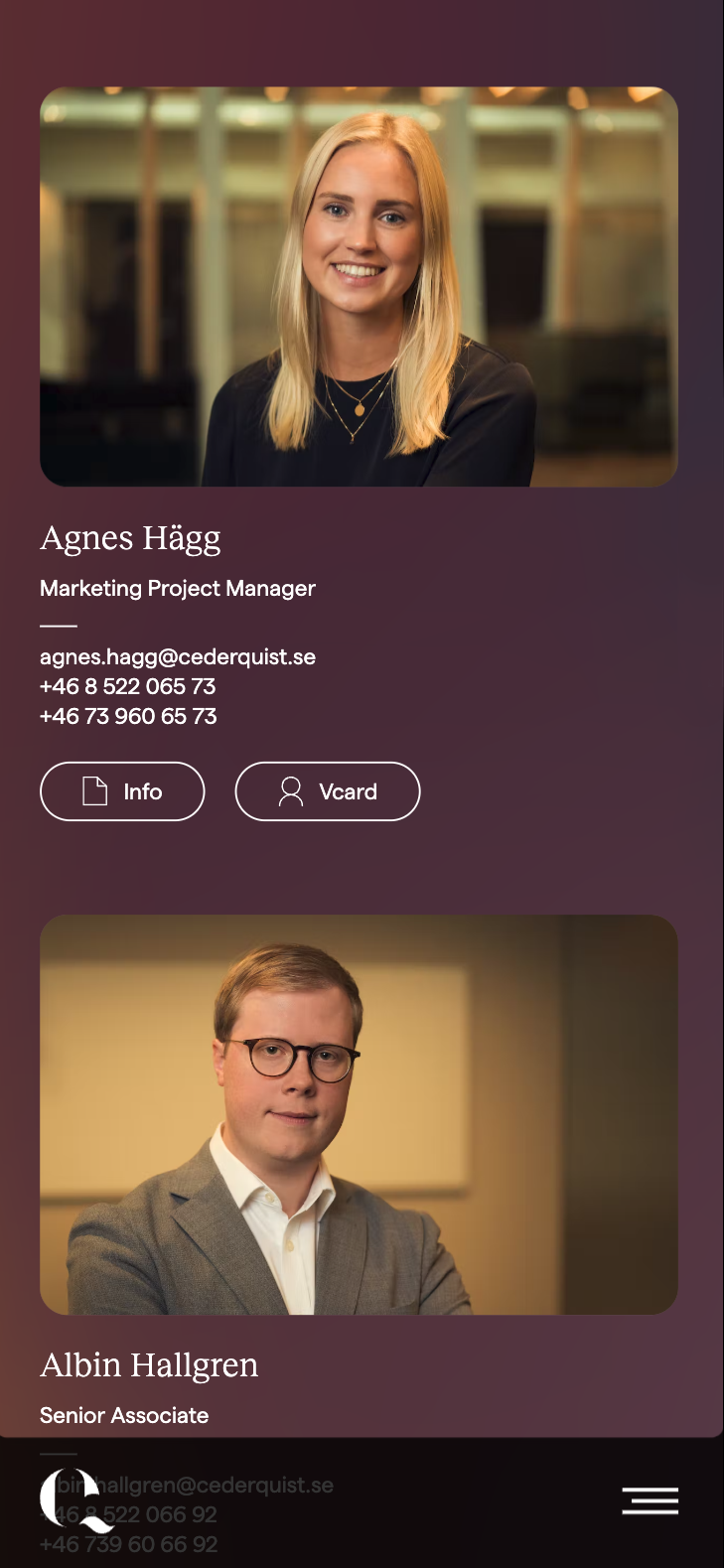
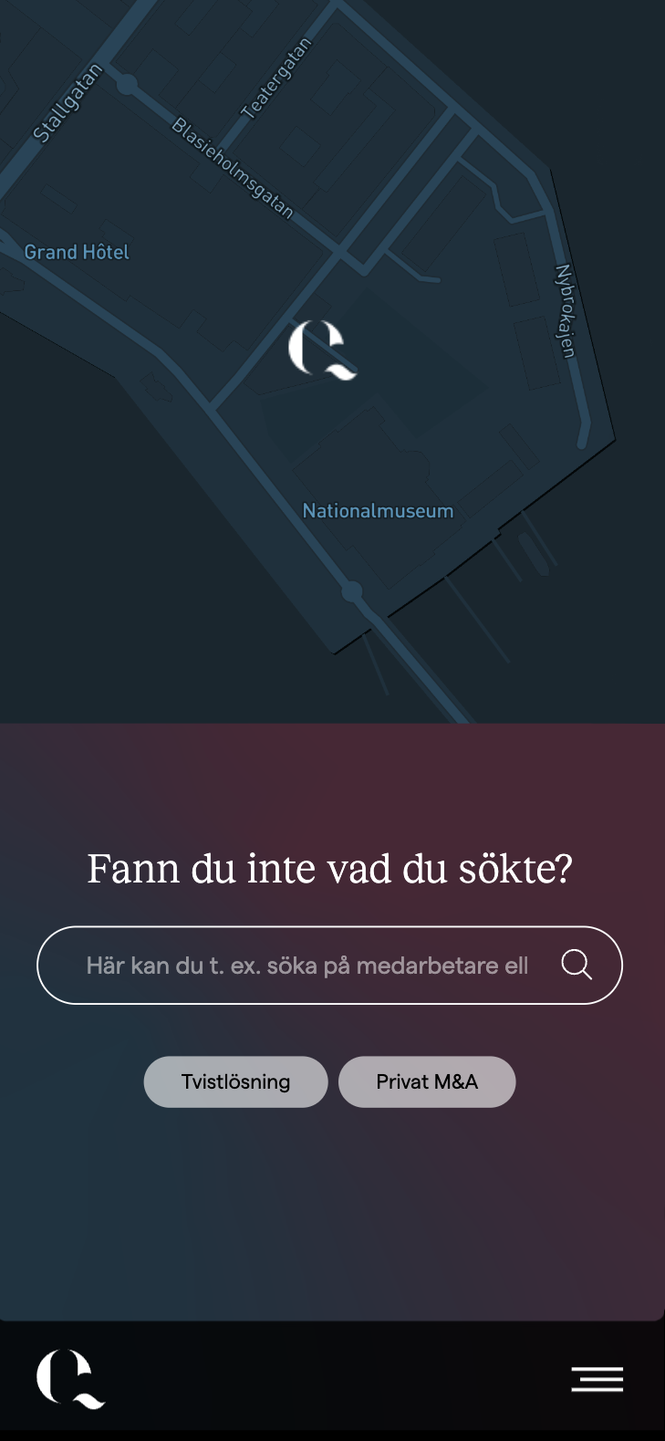
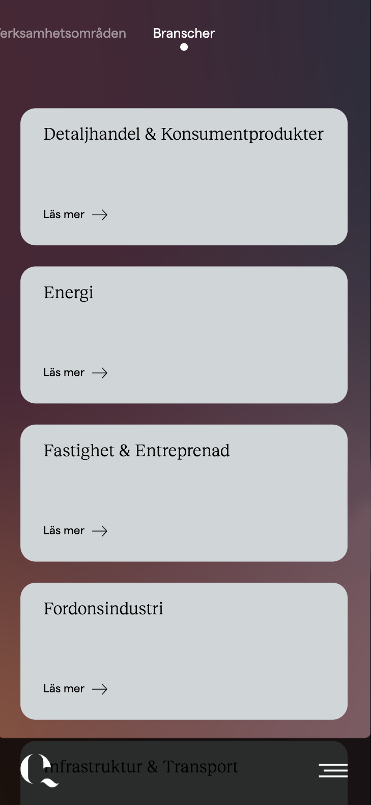
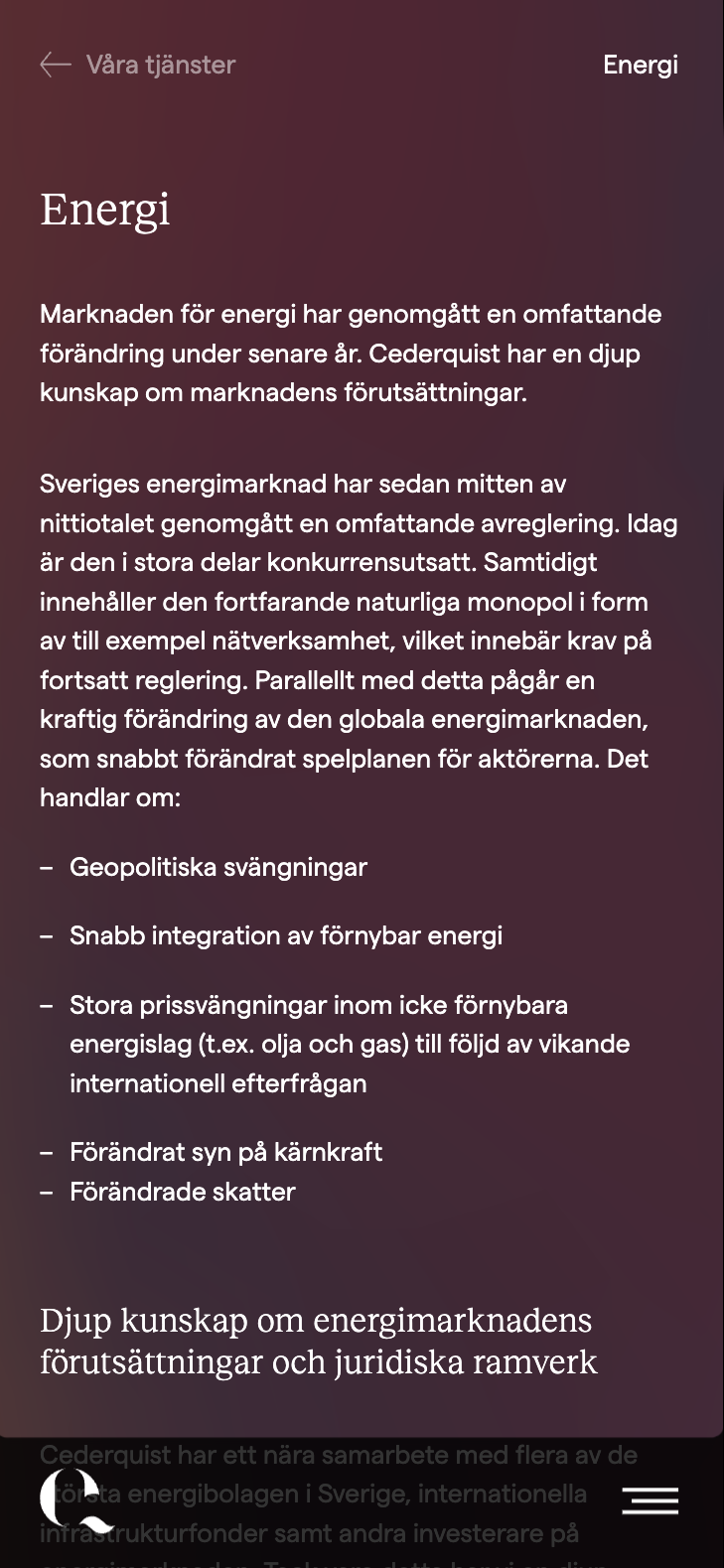
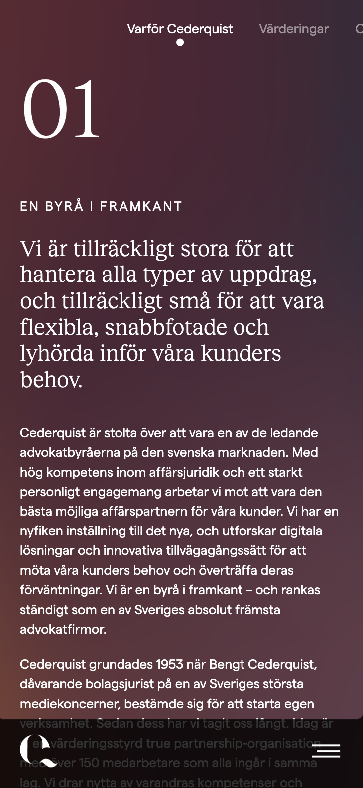
The solution was a dynamic website where everything strives to find that balance. This was achieved by shifting gradient backgrounds, 3D animations and transitions. I wanted it to feel smooth and like all the content was floating. To make it easy to navigate through all the different internal links and articles I worked with “content cards” – much like the ones you would normally experience in apps. The result was a website that pushes the boundaries for what is industry standard and stands apart from the competition.



A SELECTION OF WORK
