TWICE
TWICE
TWICE
BRAND IDENTITY
BRAND STRATEGY
CONCEPT DEVELOPMENT
BRAND IDENTITY
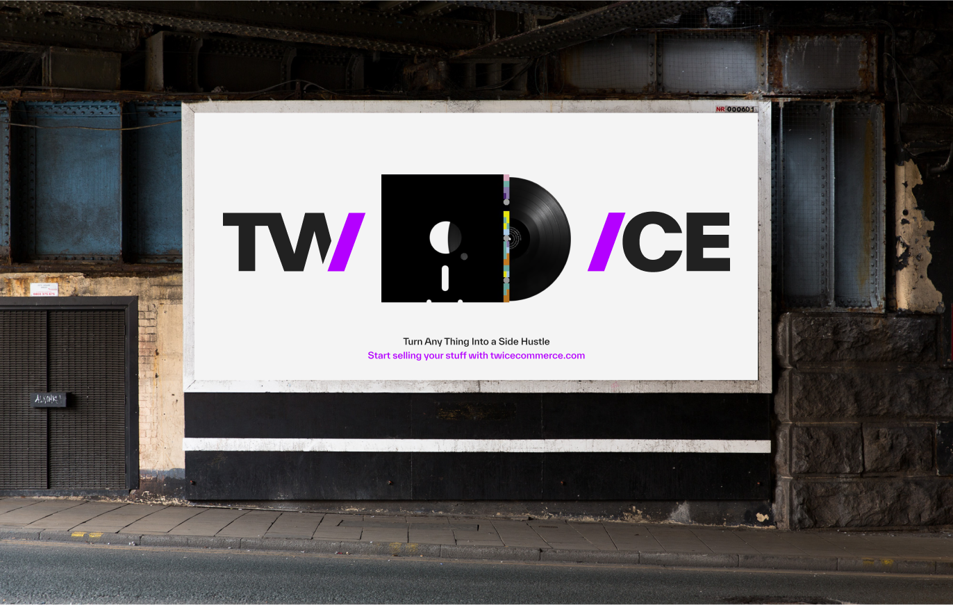
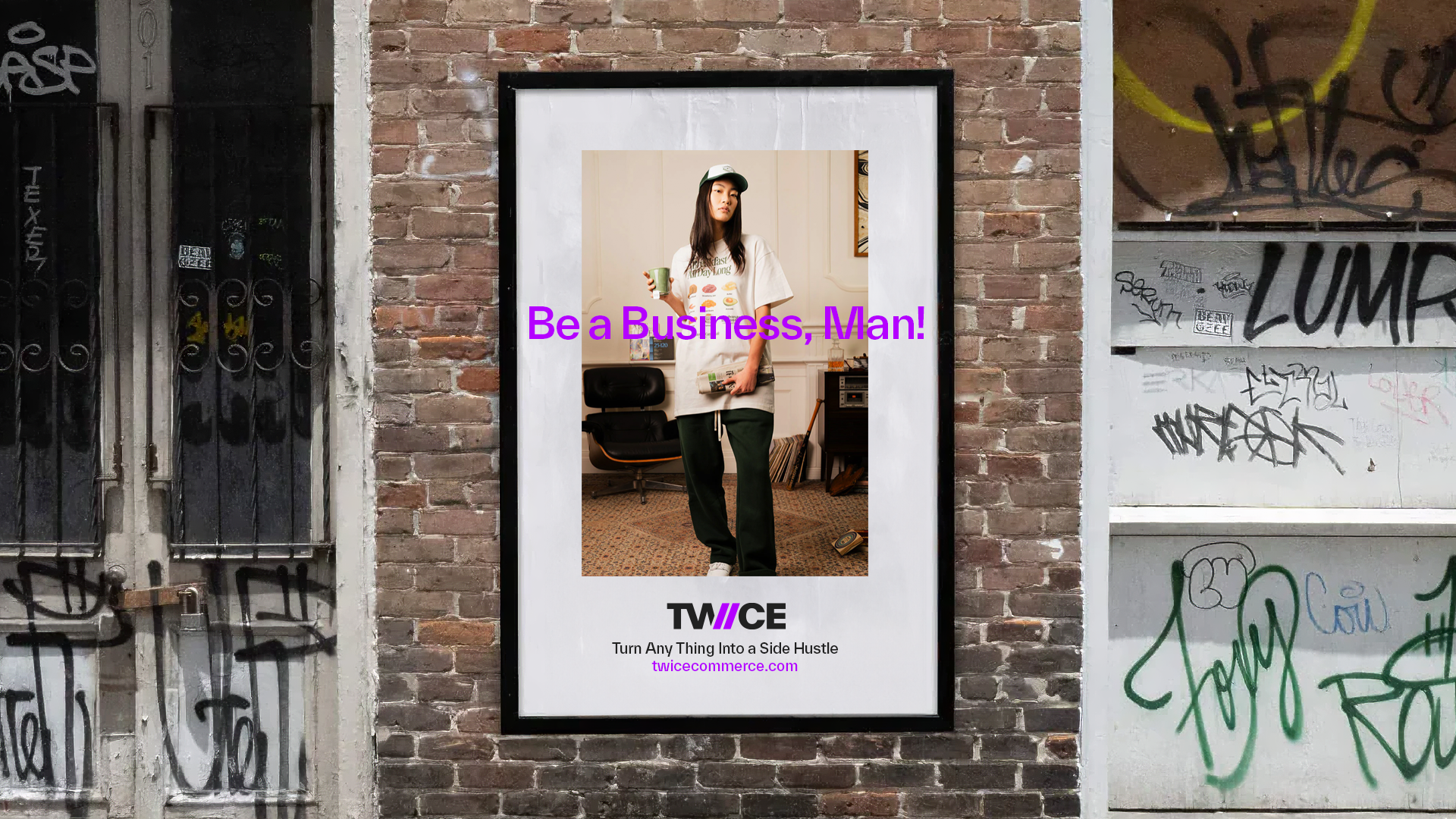
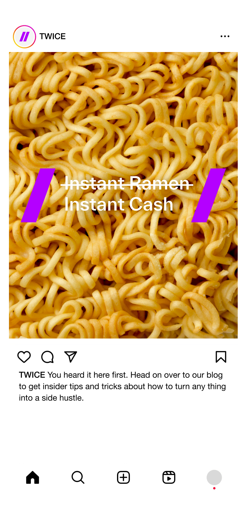
Turn Any Thing Into...
OVERVIEW
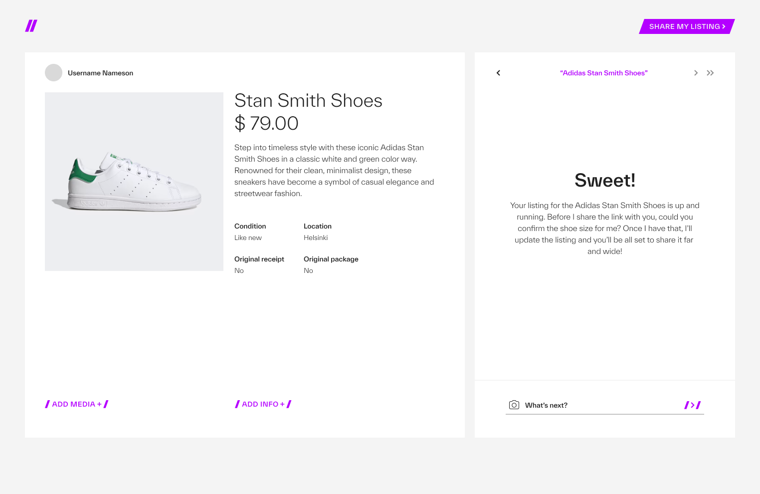
The world is, quite literally, drowning in stuff. Consumption’s new companion is guilt, and for good reasons. In a landscape cluttered with options and overwhelmed by consumerism TWICE emerges – a circular commerce platform and a global beacon of sustainable shopping.
We’re chowing down on Earth’s resources like there’s no tomorrow, that’s bad news. Both for the climate and for our collective well-being. That’s why TWICE, a platform with over 20,000 active users and a global position, is now taking a giant leap towards a more circular world.
The creative concept ”Turn Any Thing Into (a business, a side hustle, a new passion or $200)” is the communicative soul and spirit of TWICE. It’s about the spirit of entrepreneurship, and paints a picture of a business where creativity meets opportunity. Any Thing can thrive with the right support. No matter how unconventional the product or service, TWICE provides the platform where it can find its market.
We’ve continuously worked with the concept when crafting TWICE’s brand identity and communications strategy. We’re talking less about broadcasting messages and more about sparking dialogues that resonate with a discerning audience. This isn’t about the hard sell; it’s about the smart engage.
Our design principle is deeply rooted in TWICE core values: ambition, progressiveness, and most critically, a no-nonsense approach.
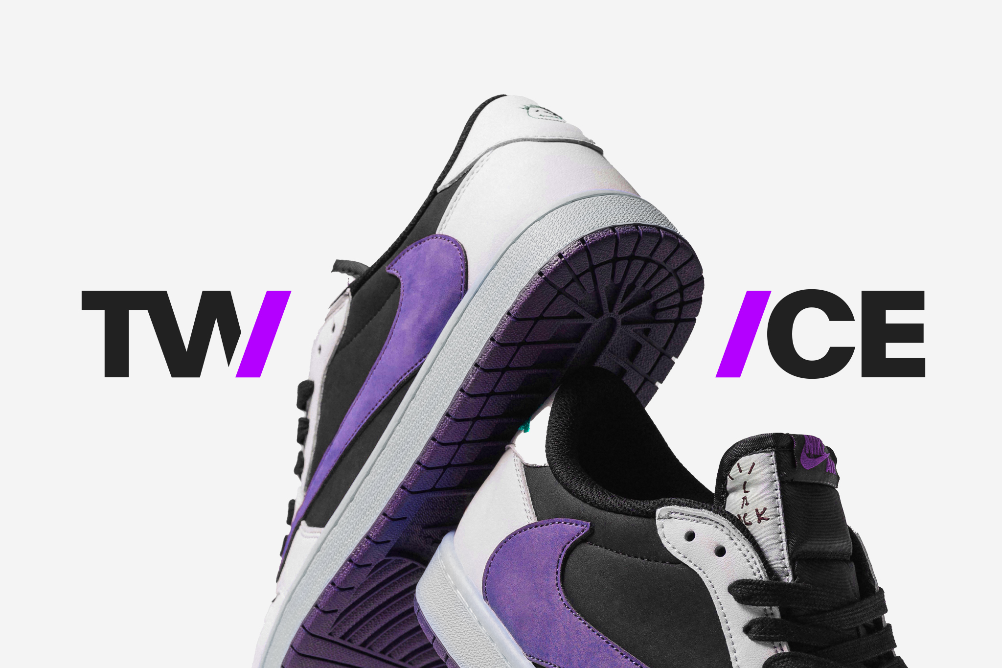
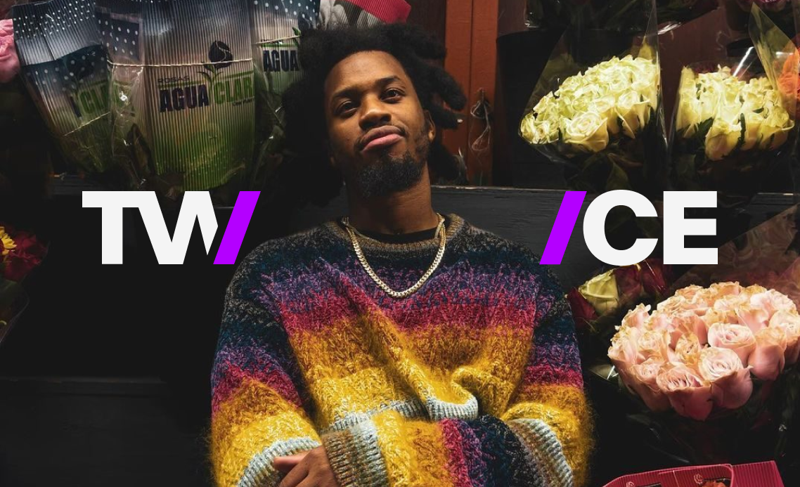
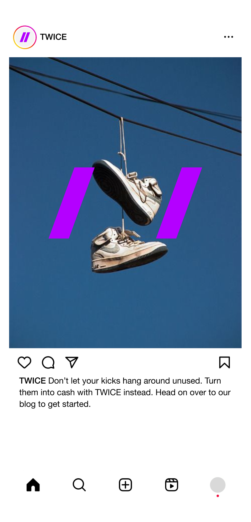
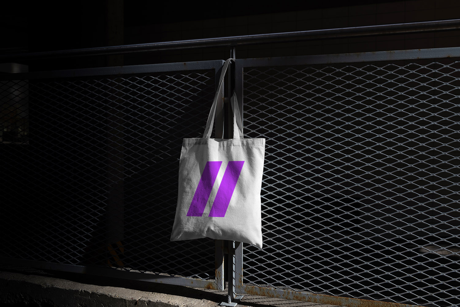
LOGOTYPE
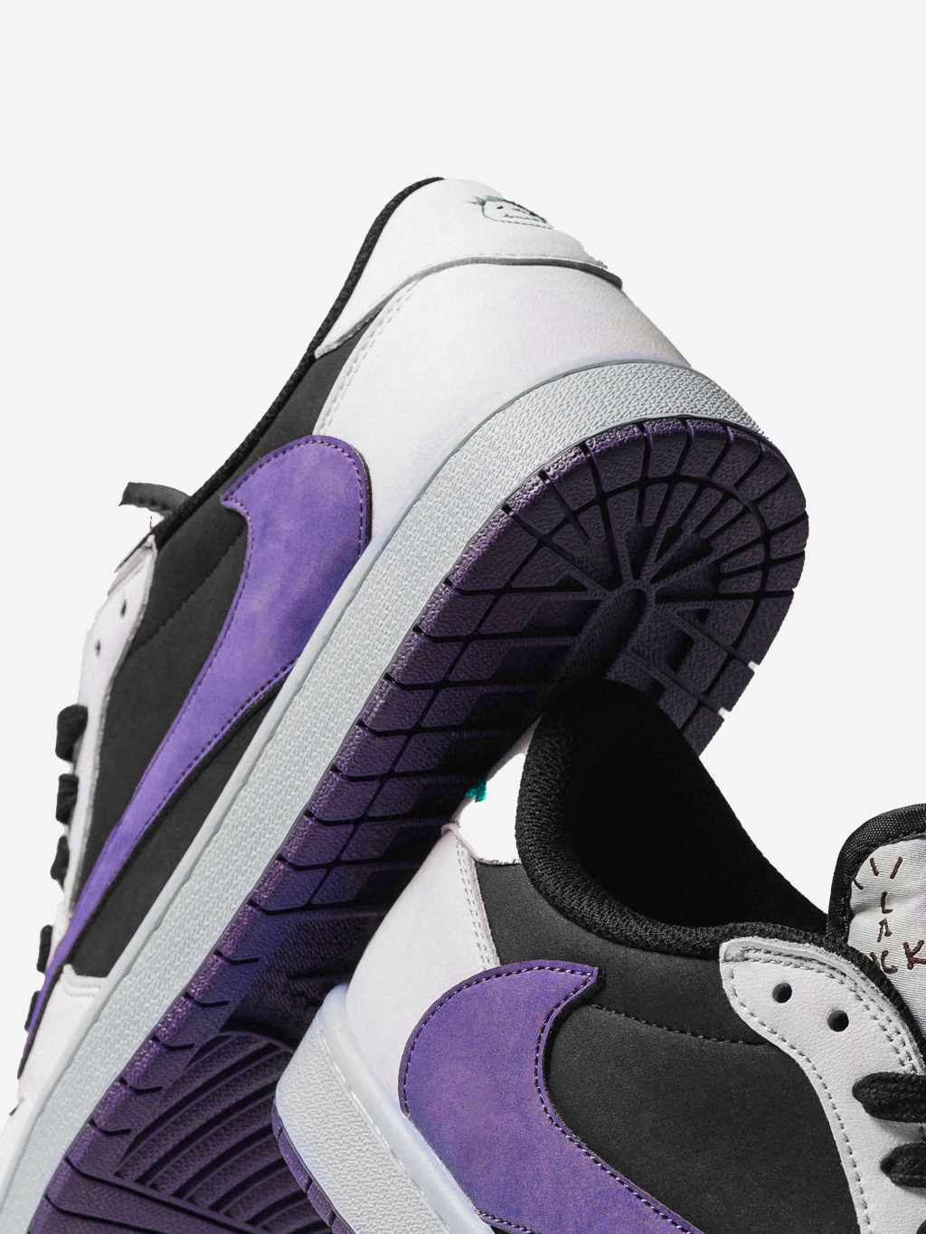
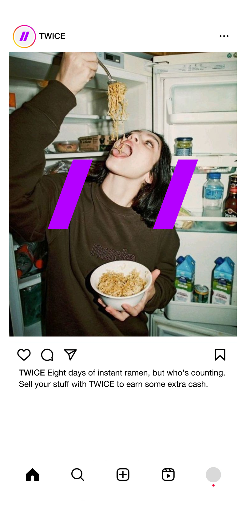
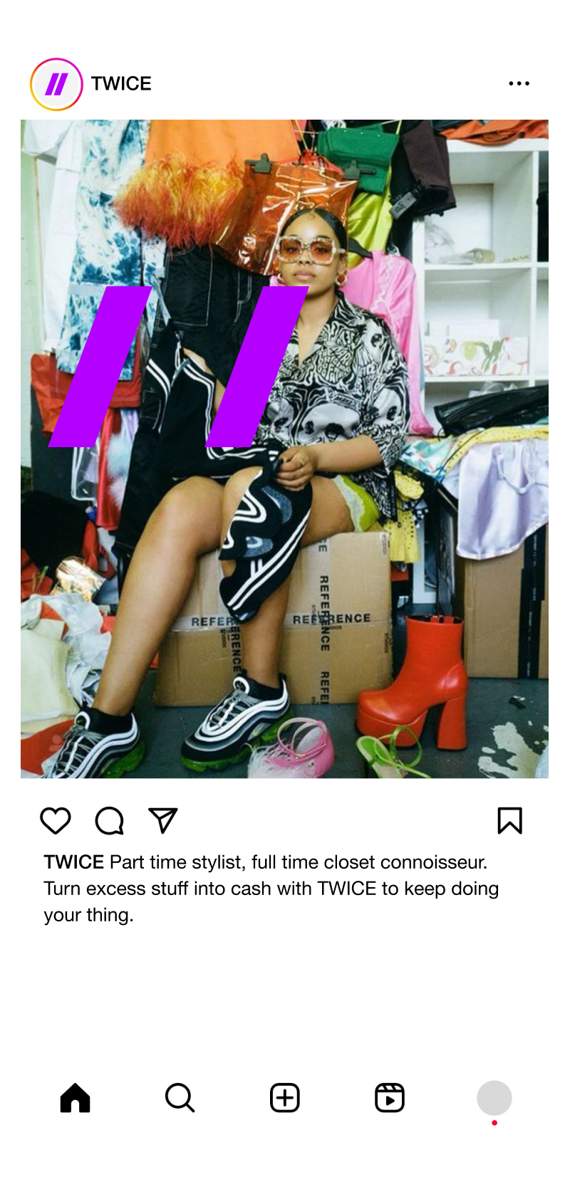
The logo represents forward thinking and constant movement, a reminder to always go forth. We’ve worked with slashes which can be used to frame different subjects, words and imagery to show that anything fits within TWICE. The slashes bring to mind the action of searching for link in a web address, which can contain just about anything. Maybe those sneakers you’ve been looking for, or perhaps that vinyl record.
LOGO AS A VISUAL NARRATIVE
The logo in the images serves as a dynamic framing device, drawing the viewer’s eye to a specific focal point within the picture. It is strategically placed to either complement the subject or to create a visual balance within the composition. We use our logo not just as a brand identifier but as a part of the bigger visual narrative.
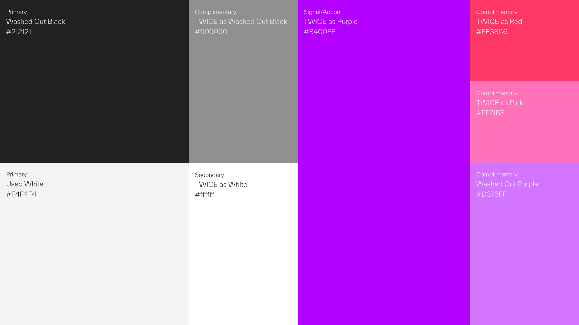
COLORS
Our color palette is inspired by the concept of working with
pre-used stuff. As a result, our black is not jet black but rather a washed-out tone. Similarly, our primary white is not stark white but slightly grayed.
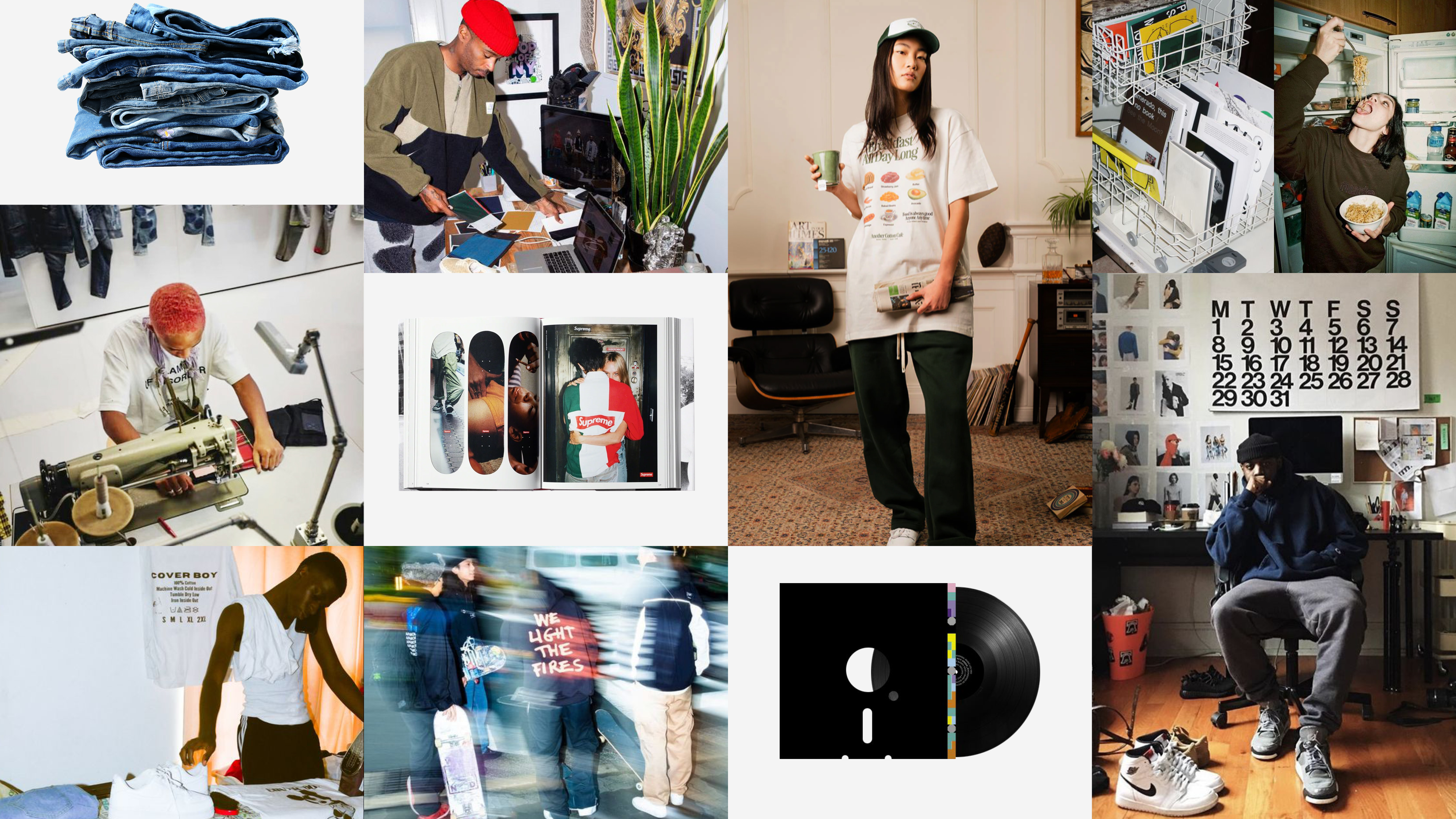
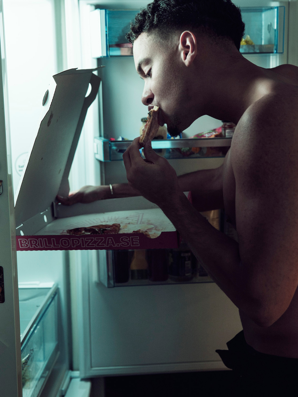
A SELECTION OF WORK