ICA MEDIS
ICA MEDIS
ICA MEDIS
BRAND IDENTITY
CONCEPT DEVELOPMENT
NAMING
BRAND IDENTITY
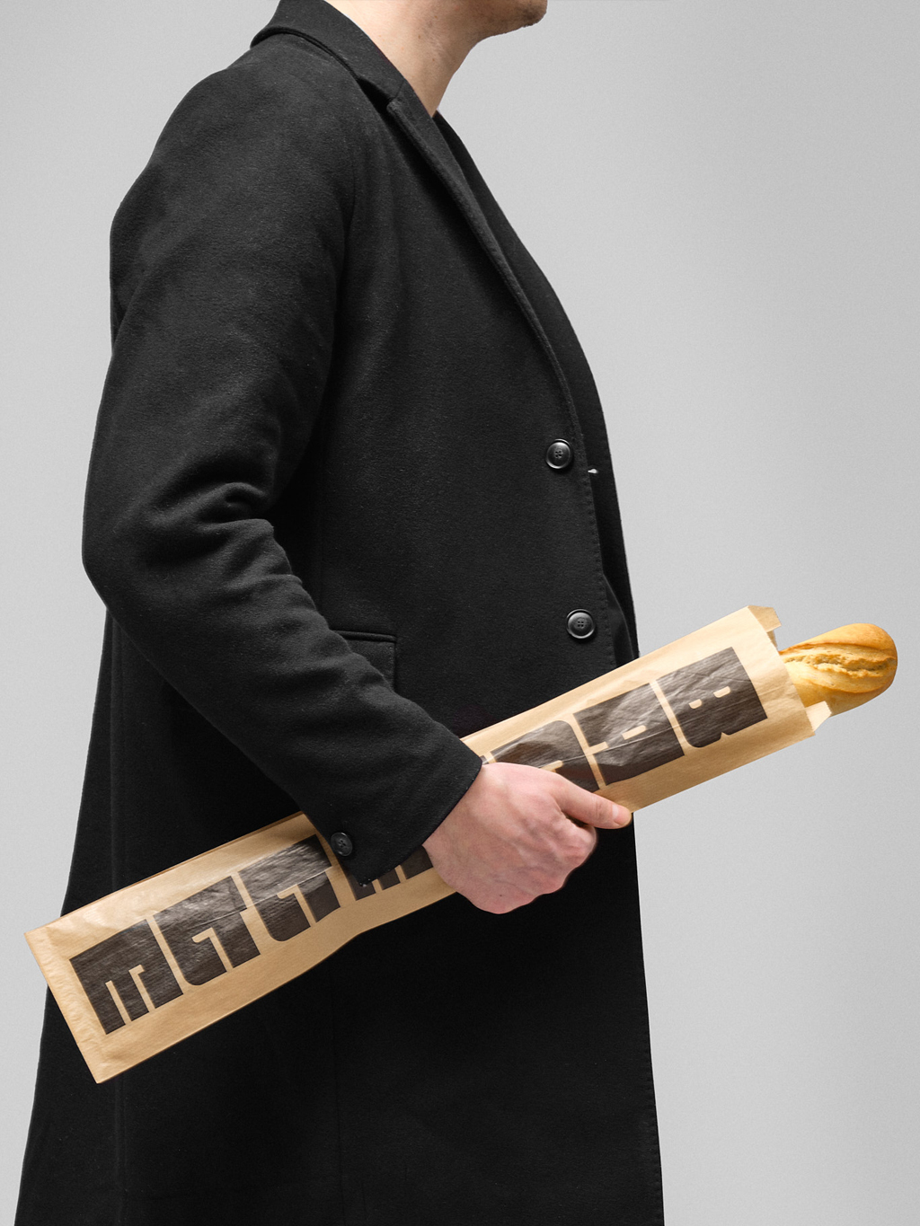
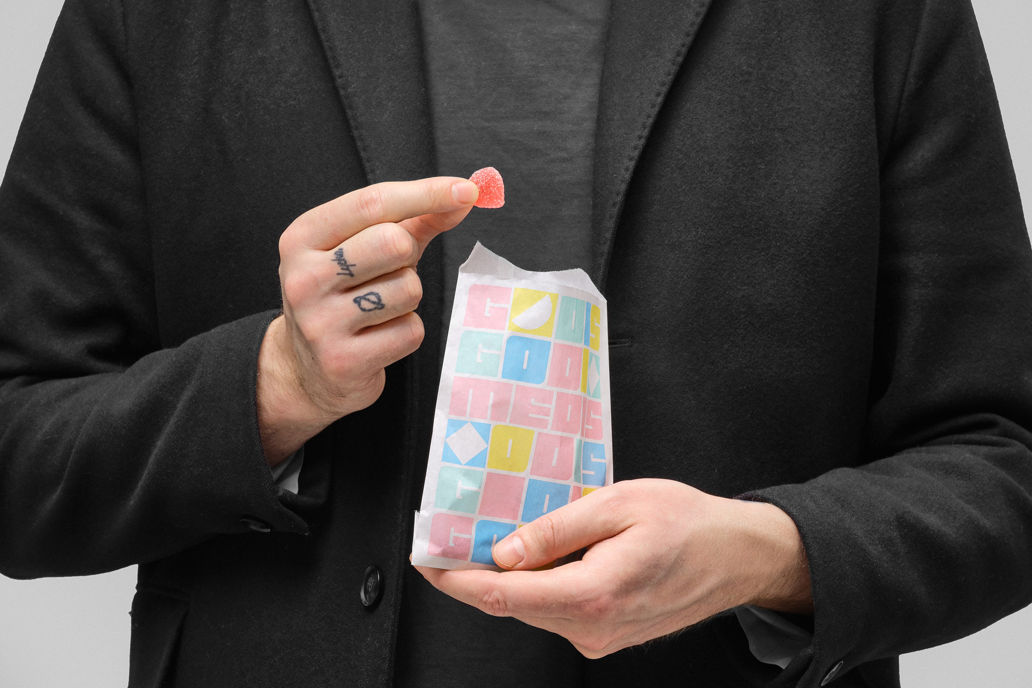
PACKAGING DESIGN
The Medis Programme – A modular way of thinking.
OVERVIEW
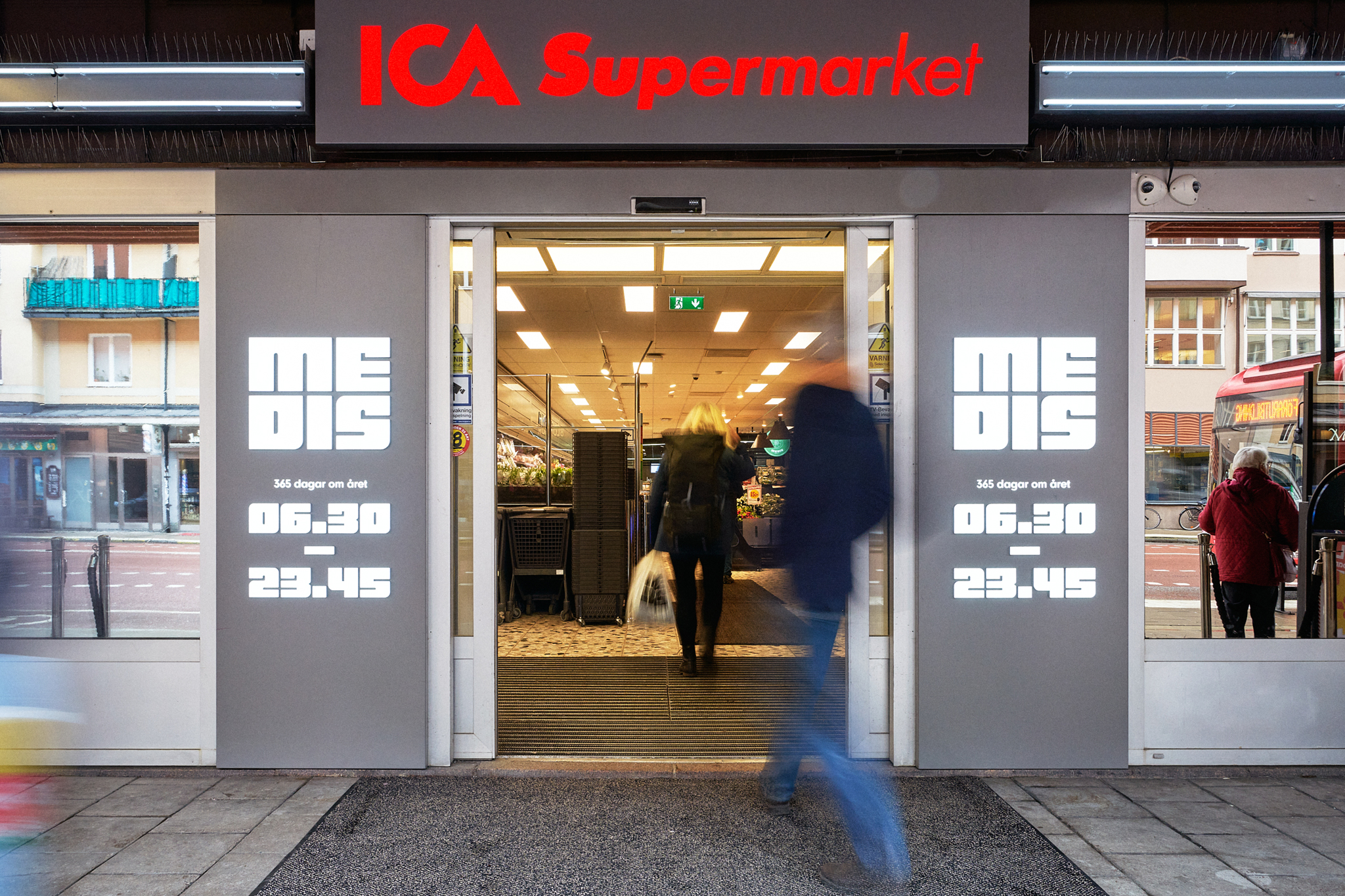
When ICA Supermarket Medborgarplatsen requested a new stylish and versatile graphic identity, it may sound odd to draw inspiration from a building that has been voted Stockholm's ugliest. But since the desired design also needed a strong connection to the local area, I chose to look as locally as possible, right at the building where the store is located.
"Vägaren 23," as architect Bengt Lindroos describes it himself, may be his "problem child," but it serves a much more important function than being beautiful. The building is a product of the later stages of the Million Program, and by studying the streamlined design of that era, I found a design solution that could be easily and variably assembled, much like LEGO pieces.
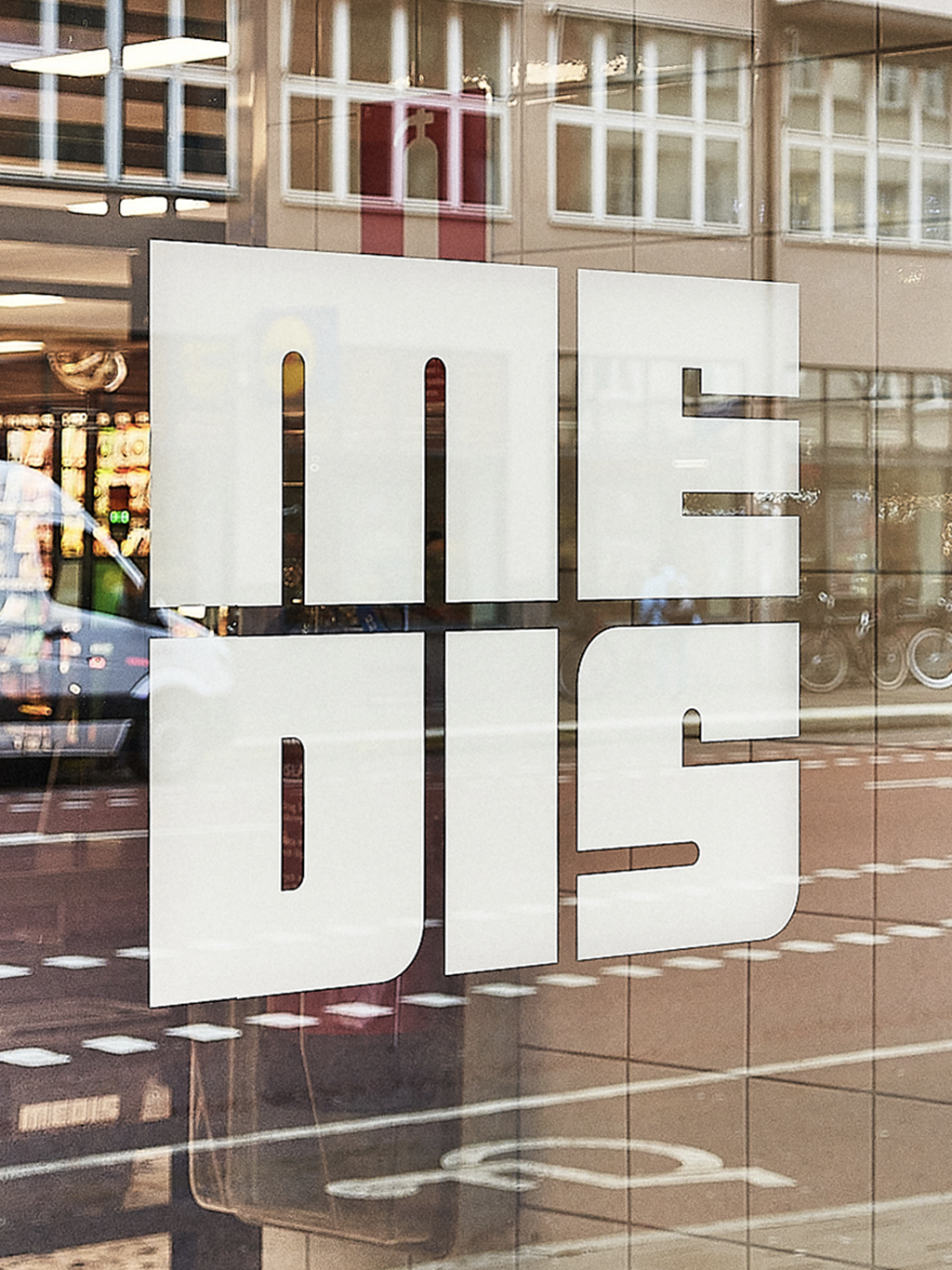
To further connect with the local context, we decided to rename the store to ICA Medis (Medis is what the locals call Medborgarplatsen), as it is known today.

The Building – Vägaren 23, drawn by Bengt Lindroos 1971.
The Building – Vägaren 23, drawn by Bengt Lindroos 1971.
With inspiration drawn from Stockholm's ugliest building and the Million Program, a modular approach forms the foundation for a functional graphic identity that exudes timeless Swedish design.
With inspiration drawn from Stockholm's ugliest building and the Million Program, a modular approach forms the foundation for a functional graphic identity that exudes timeless Swedish design.
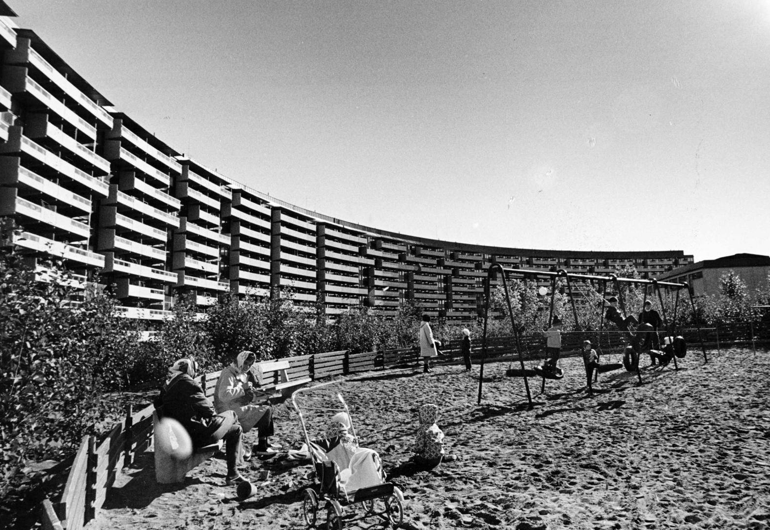
The Million Programme
In order to quickly construct many, preferably reasonably large residences, construction must be rationalized. Ready-made concrete elements, like Lego pieces, are needed, which can be manufactured in factories and then assembled in various ways.
At the end of the 1960s, there were sixteen different so-called structural element systems for housing. Today, when building new residences, there are only four. The possibilities for variation today, in the era of choice, are thus far fewer than they were in 1967.
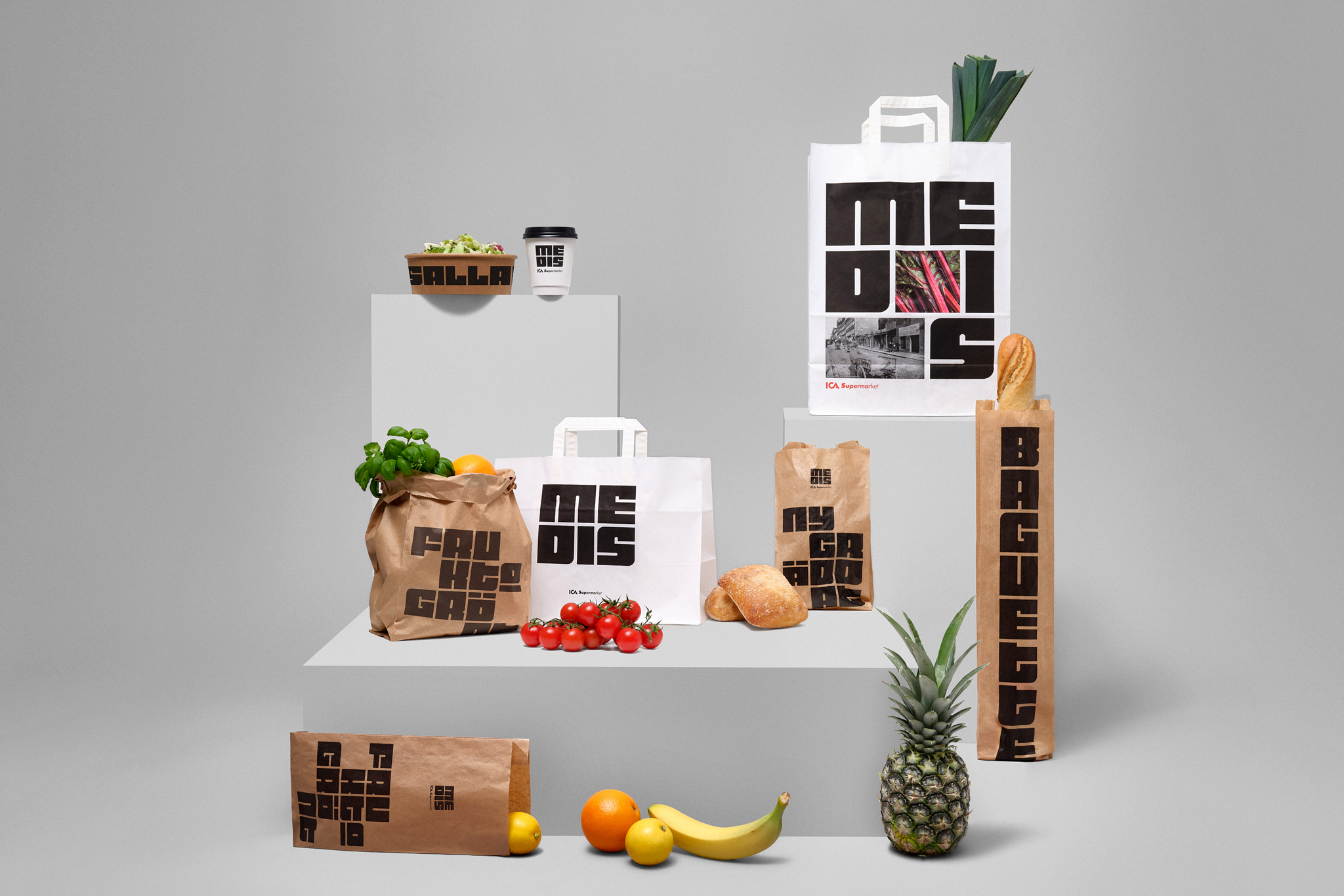
MEDIS MODULAR
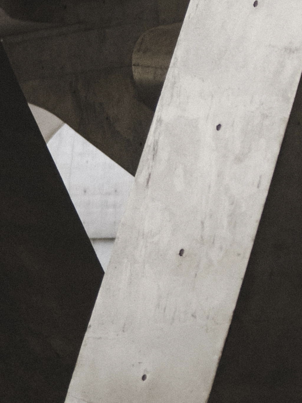
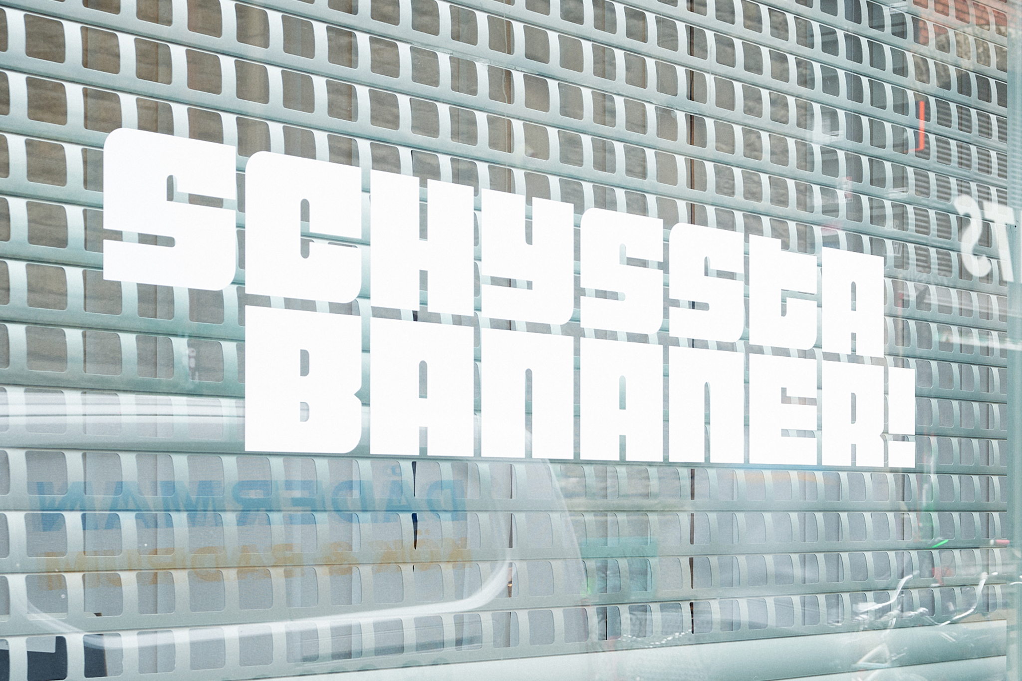
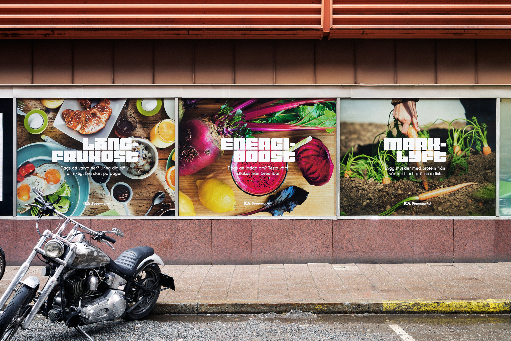
Central to the new graphic identity is the custom-designed modular typeface. By embracing the modular system of the Million Program, the typeface was created based on a grid with endless possibilities for variation. Each letter becomes a modular element that fits together with all the others. The typeface was developed in collaboration with Göran Söderström at Letters of Sweden.

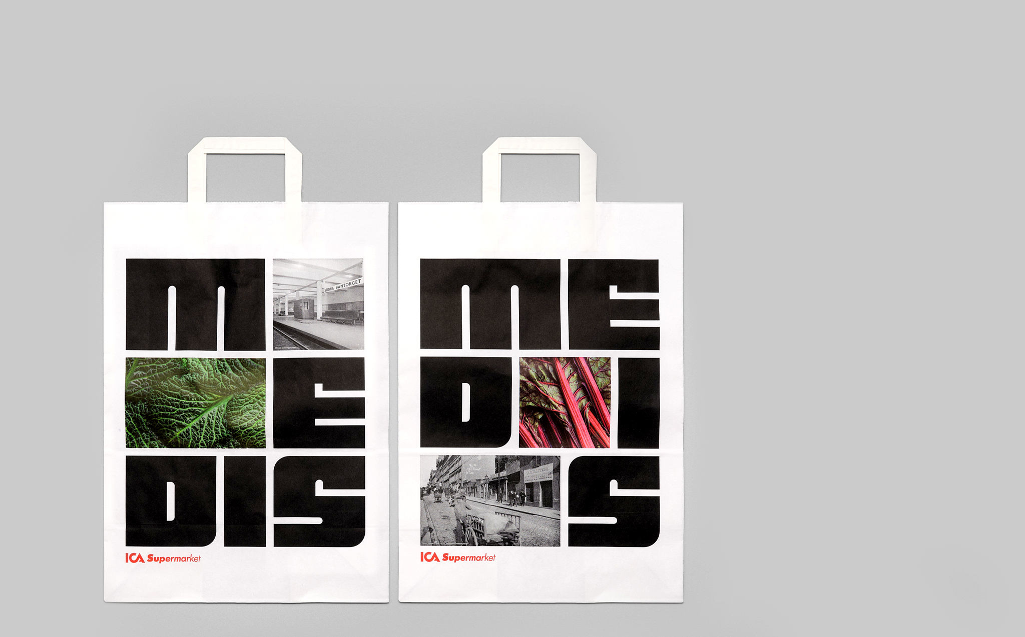
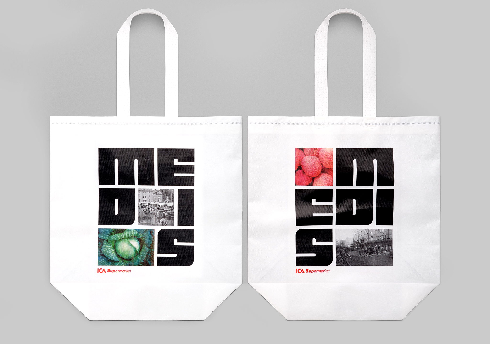
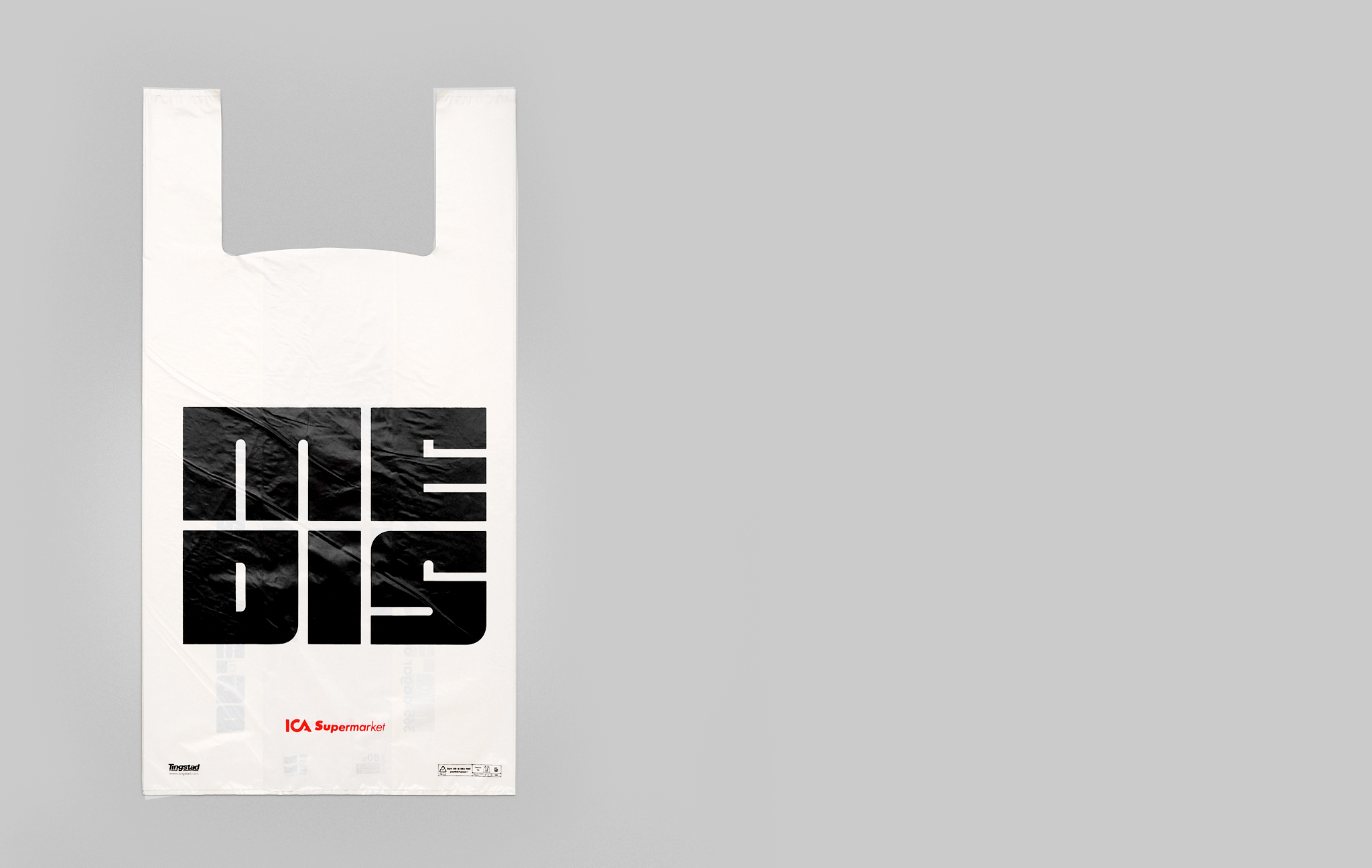
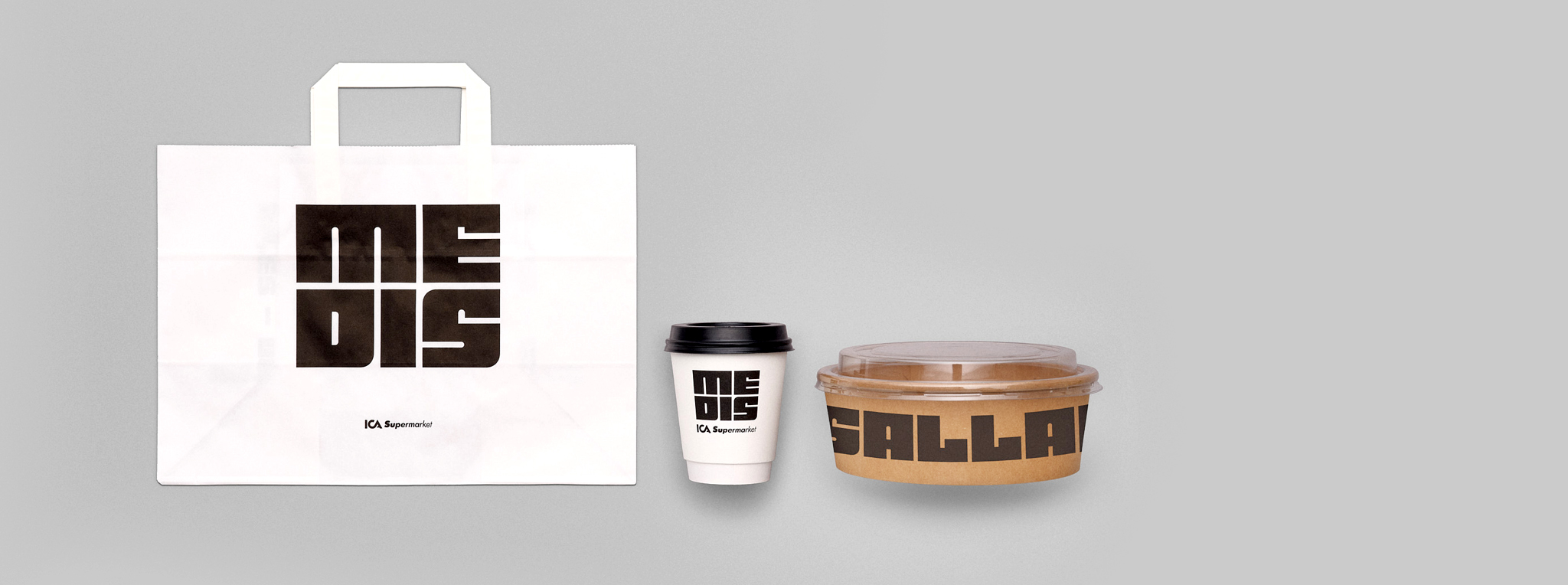
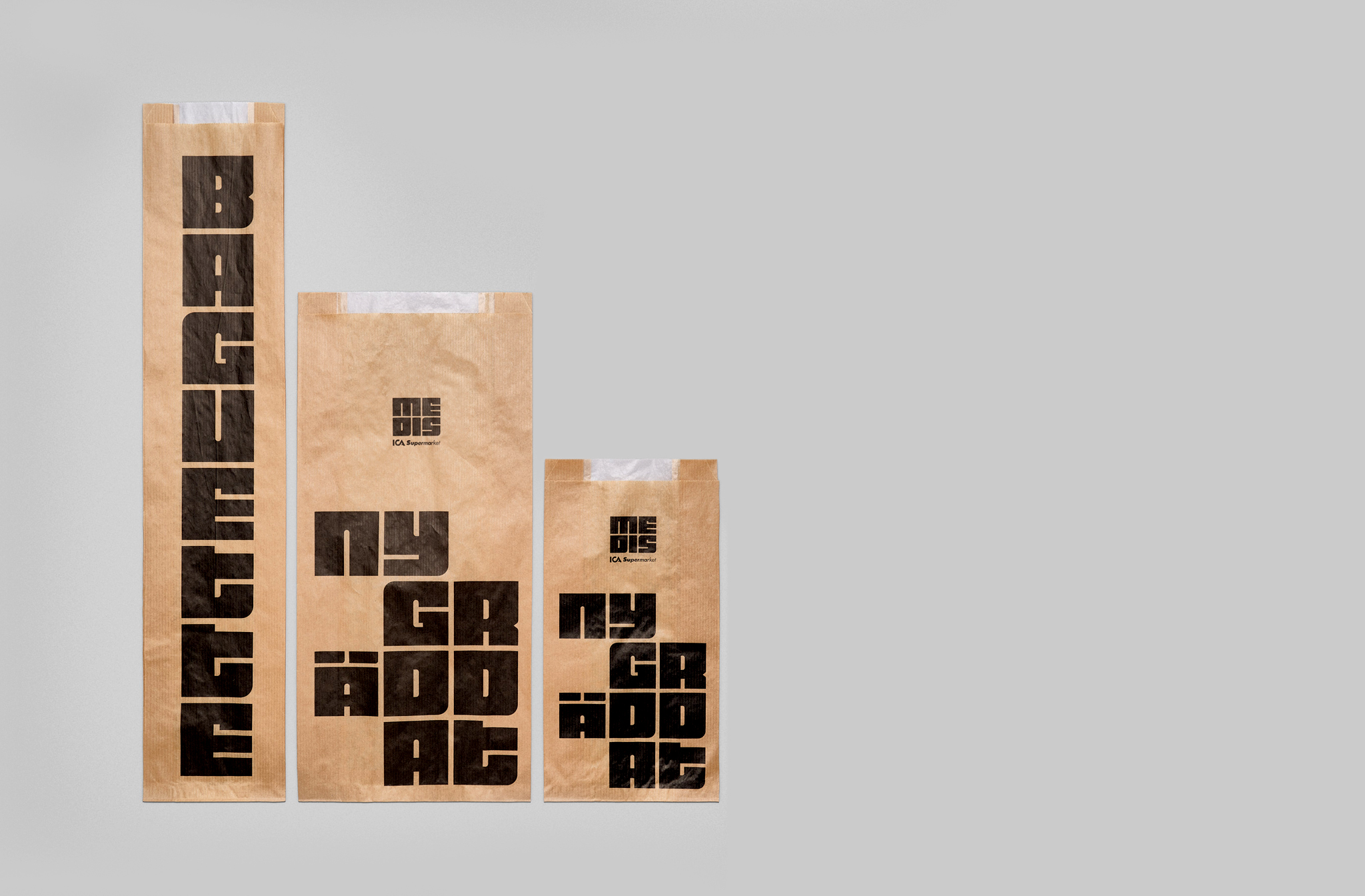
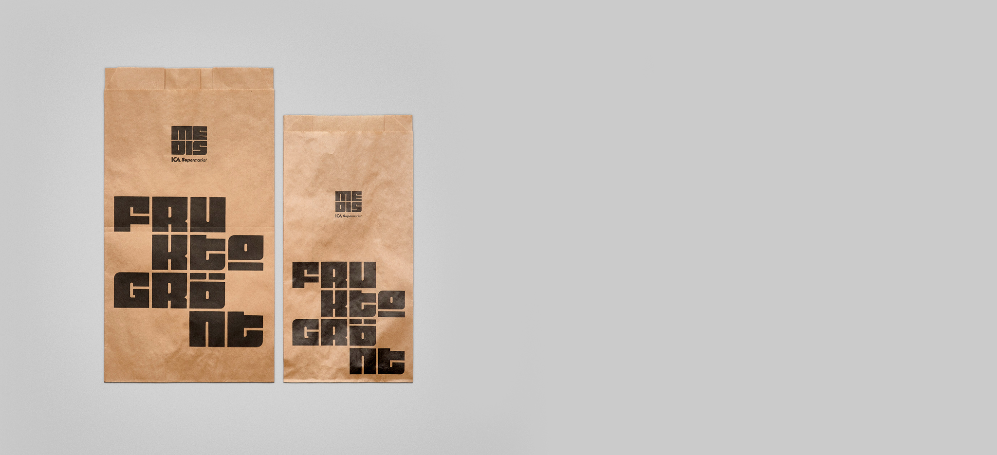
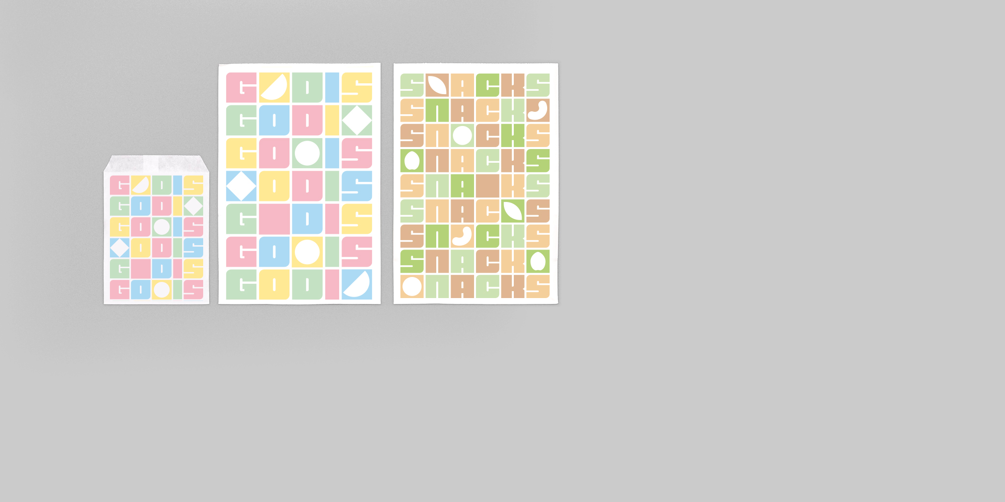
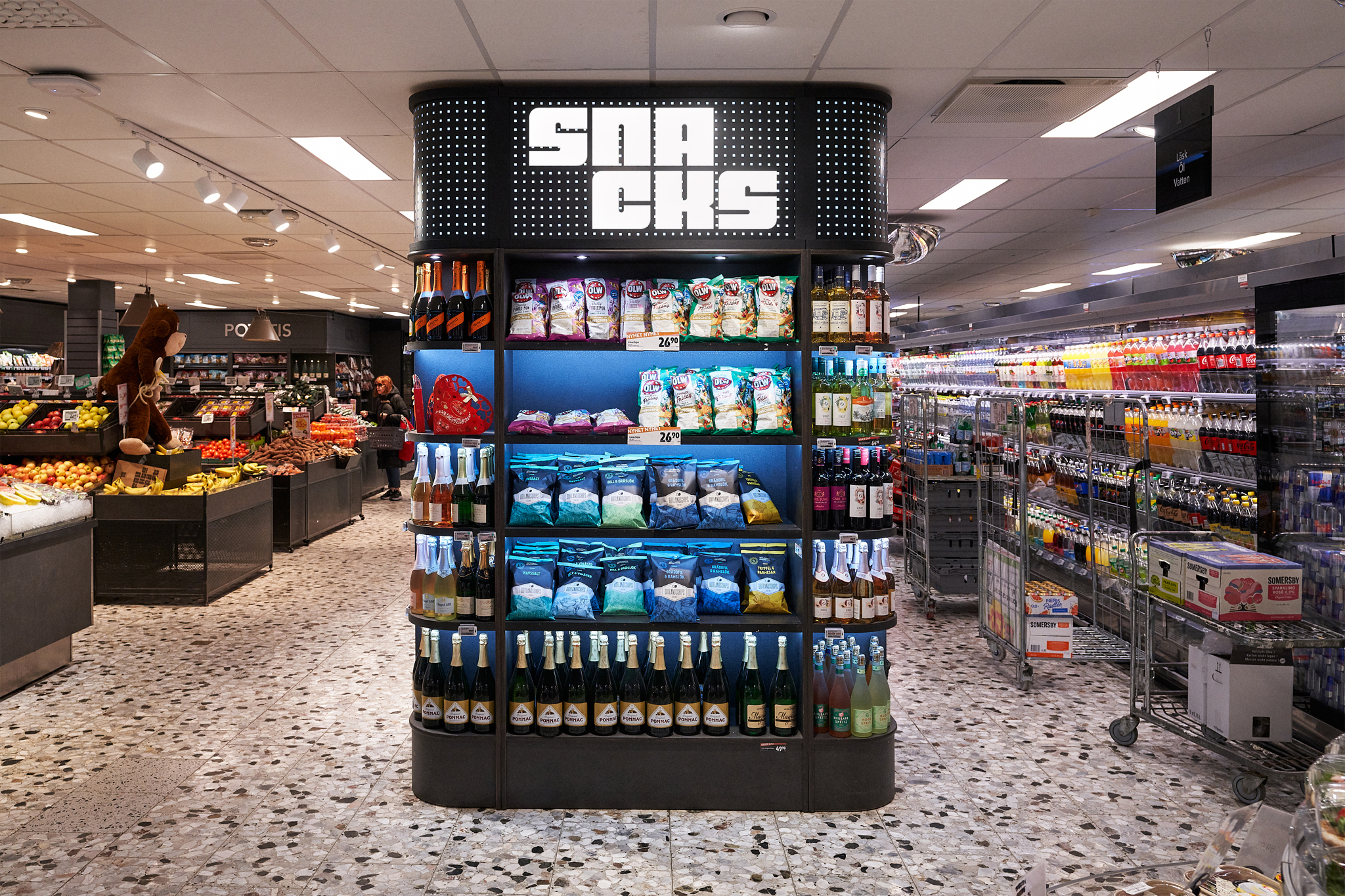
With the graphic modular system, we can easily assemble the typeface with images in the same grid and create a dynamic word-image composition. To add value, images of food are combined with historical pictures from the area. By using this system, both typeface and images can stand out on larger surfaces, making ICA Medis more clearly communicated.


A SELECTION OF WORK