REVELOP
REVELOP
REVELOP
CORPORATE IDENTITY
BRAND POSITIONING
CONCEPT DEVELOPMENT
NAMING
BRAND IDENTITY
BRAND GUIDELINES
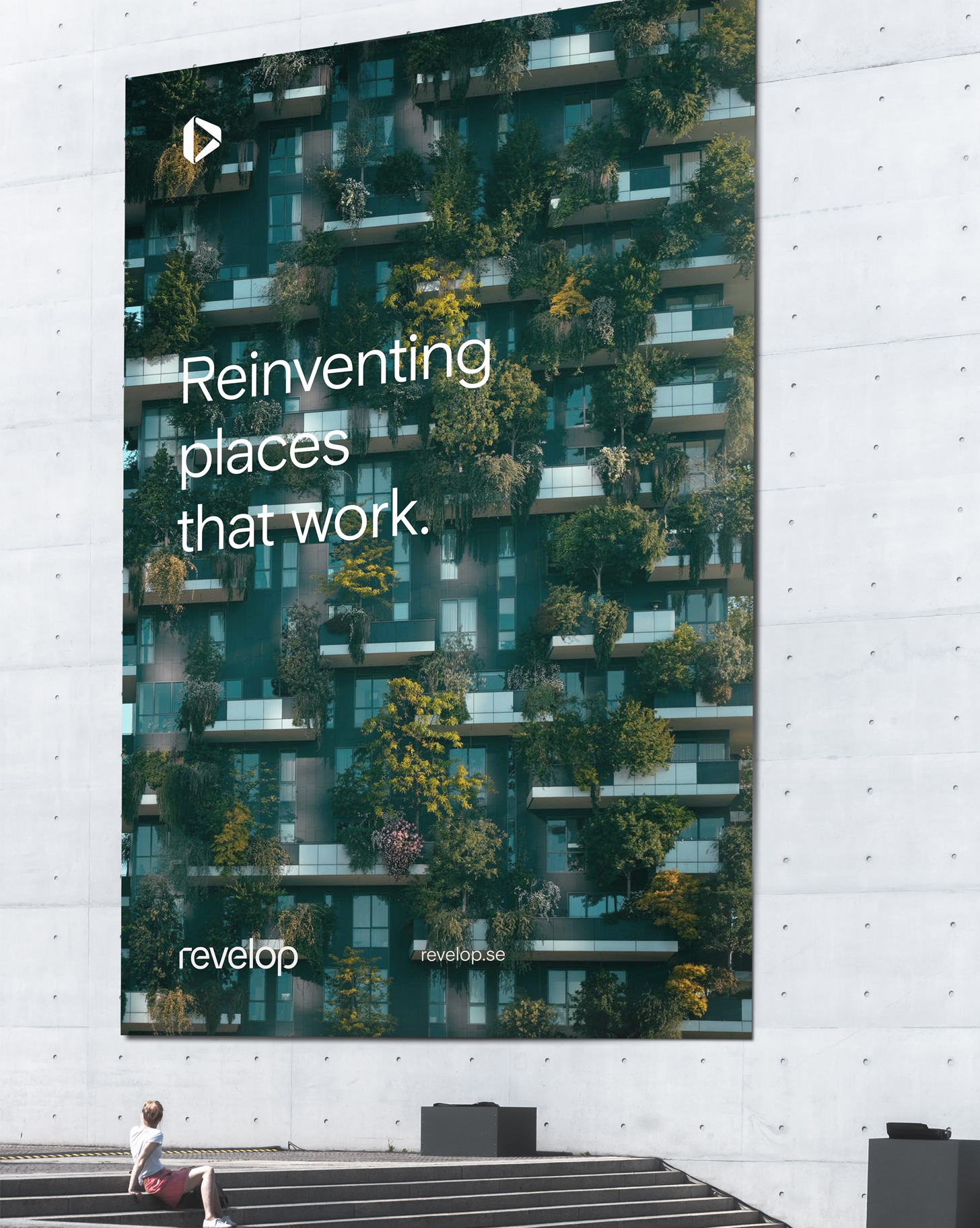
Revelop – Reinventing
places that work.
OVERVIEW
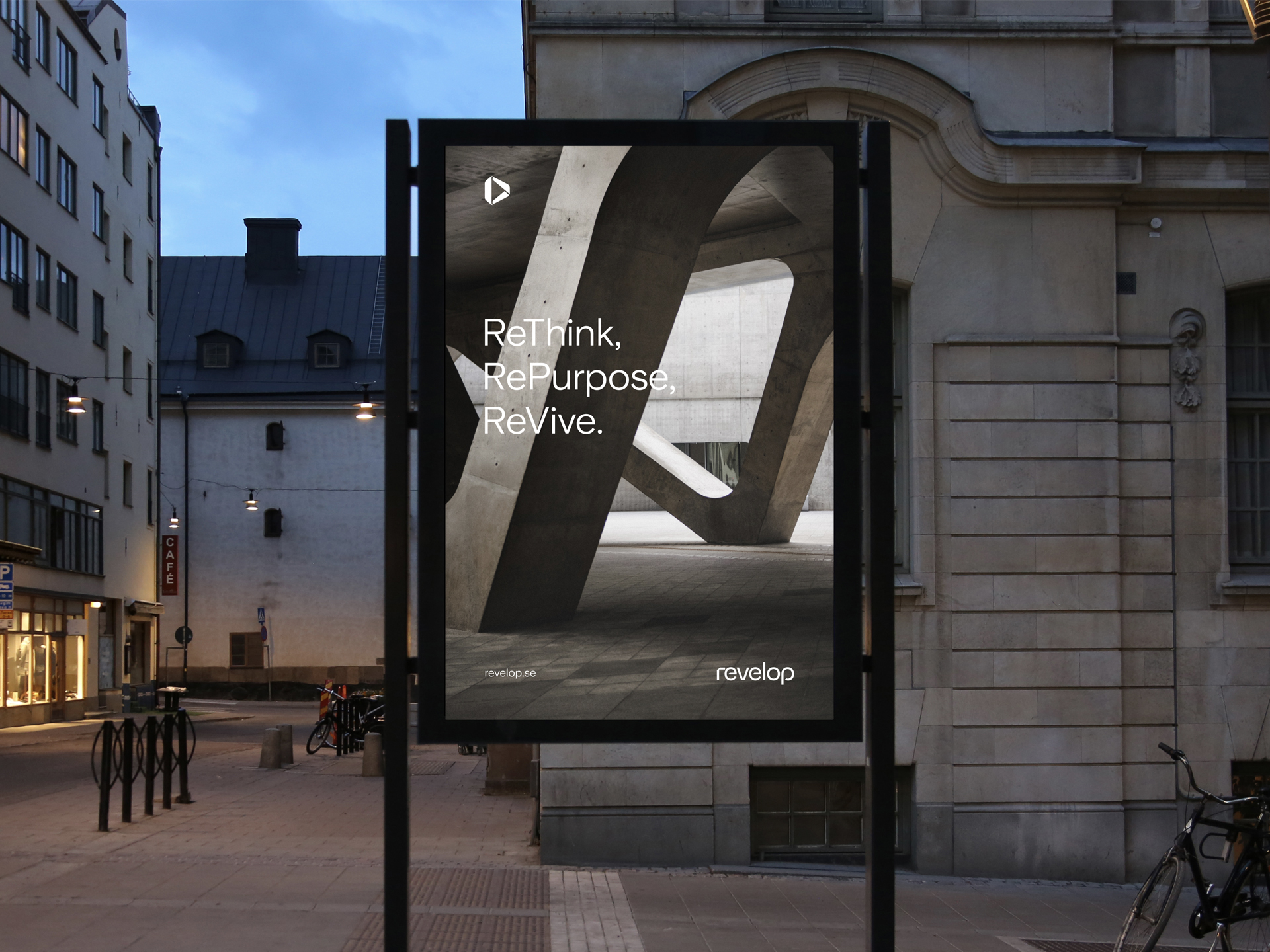
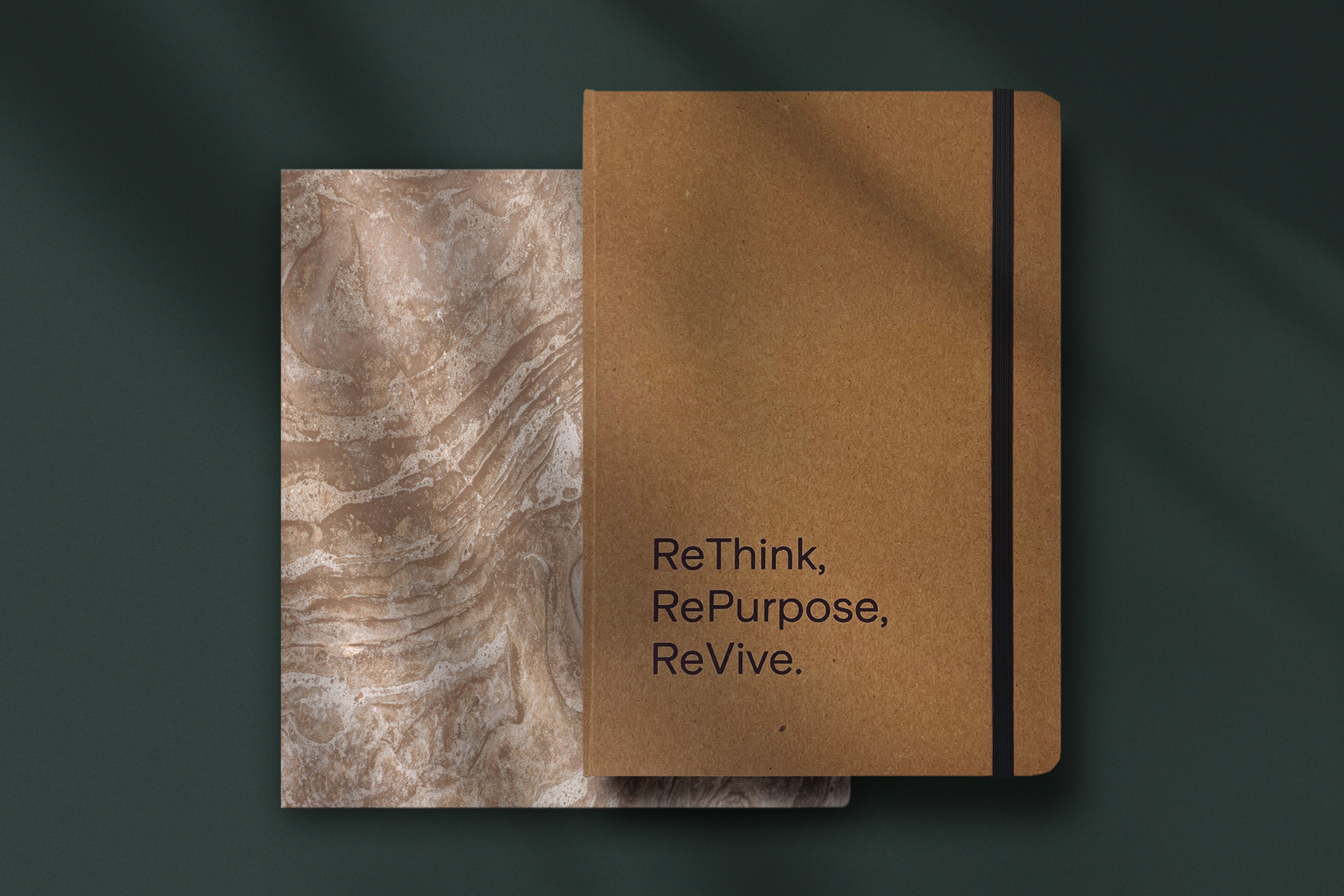
The company formally known as Profi fastigheter have been around for a long time, they’ve done well and delivered good results. But with new management in place, they wanted to strengthen their position and align the brand with their business idea: it was time to ReThink, RePurpose and ReVive.
Revelop goes to places where no one else is looking. They seek opportunities where others see challenges and invest in places where they can create a positive, long-lasting impact by repositioning and developing properties with a distinct focus on sustainability.
Even though their whole business model revolved around a sustainable foundation it was neither communicated nor conveyed in their branding. The scope included everything from brand positioning strategy, naming and brand identity, down to designing the business cards.
COMPANY VISION
We create sustainable environments for the present and future generations.

REINVENTING
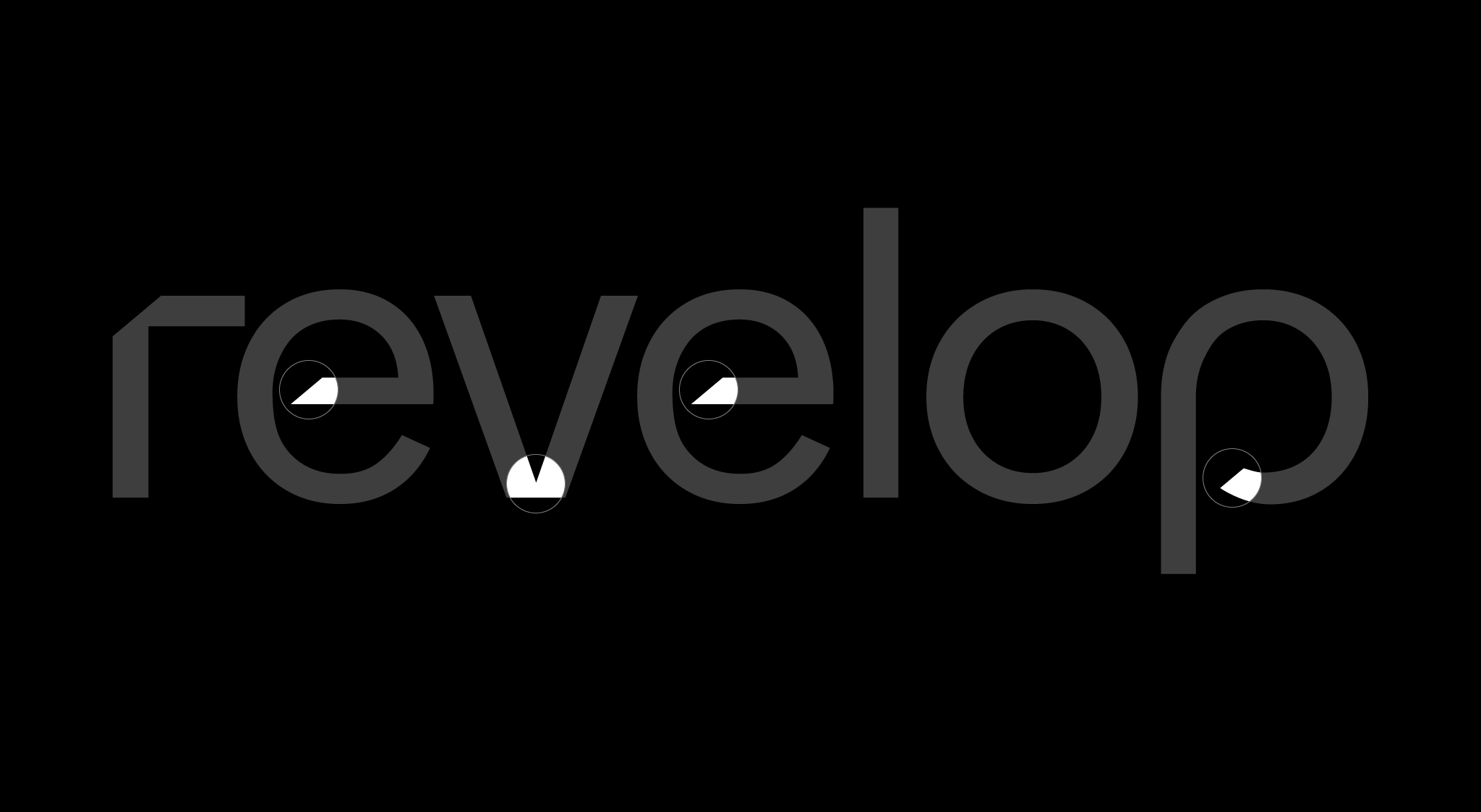
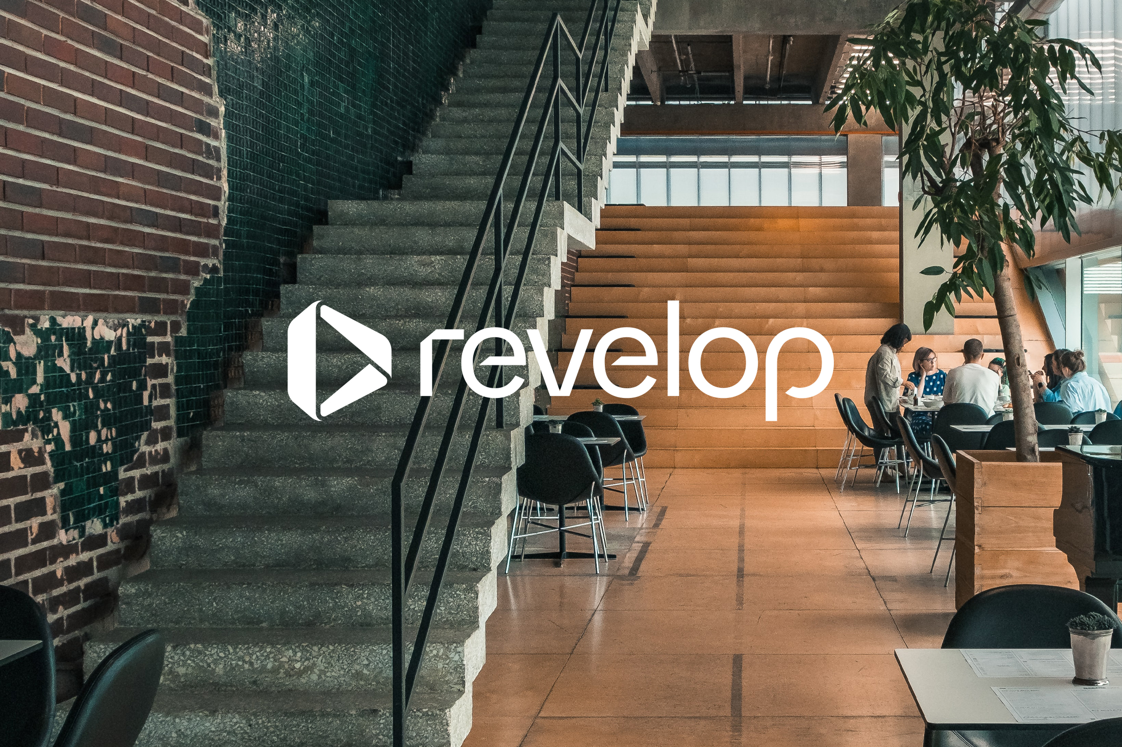
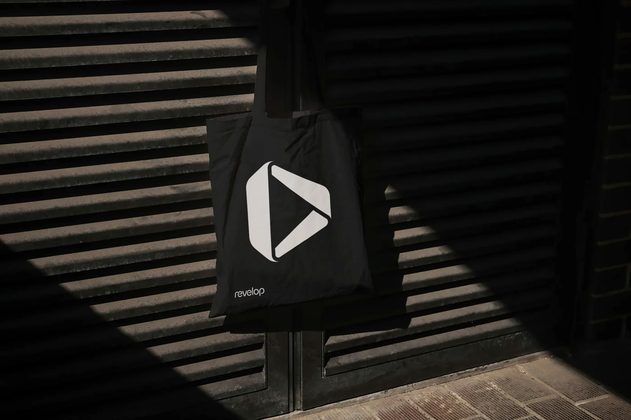
The symbol draws inspiration from the Möbius strip. The möbius strip symbolizes a continuum, turning itself inside out, constantly reinventing itself. It also symbolizes sustainability and can be found in the traditional recycling symbol. This goes well with Revelop’s vision and mission statement that talks about reinventing areas and properties to create sustainable environments.

PROPERTIES
The outline shape of the symbol is that of a three-dimensional block or building. An architectural structure that portrays their core business which is property development.

OF TOMORROW
The inner shape of the symbol has the shape of an arrow pointing forward, this coincides with Revelop’s idea to bring value in the long run by developing properties that proves cost efficient in the long run. Properties that will stand the test of time – they build for present and future generations.

A SELECTION OF WORK
